.jpg)
*This story was made possible by the generous support of Sauder, and features gifted product for testing purposes. All opinions are my own.
Today’s post is part of a mini series I started here showcasing some interior photography and styling I did for Sauder. We’ve been ordering furniture from Sauder for years and years, and always love what we get! I thought this would be a fun chance to send the brand a bit of extra love for their support of me and my business over the last decade, and to also (of course!) offer you some styling inspiration for your own homes. Keep scrolling to learn some of my easy tips for styling a tall bookshelf like this one.
.jpg)
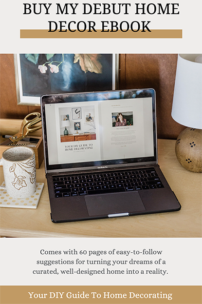
First of all, don’t be discouraged if you don’t get your styling quite right the first time you take a crack at it. I think it took me three or four tries to really nail the look here, and that’s very typical of my process. It doesn’t bother me anymore when things don’t come together on the first try (I explain my styling process much more in depth in my home décor eBook, which you can check out here). Just try a few arrangements, step back, evaluate, and then tweak until the arrangement looks good to go.
One of my favorite tricks is to take a photo of the setup with my phone to see where the inconstancies lie. I can’t explain why, but you really can spot changes that need to be made in a digital photo much easier than you can in person.
.jpg)
When I style a bookcase I like to include a mix of items to give it more of an organic look. In other words I don’t just include books! I have an easy formula for any bookshelf I’m styling: books, plants, ceramics, and one or two oddities thrown in just for fun (think: an artsy sculpture, brass animal figurine, leaned piece of art, etc.). The two oddities that I chose here are the pretty watering can and the decorative wooden box on the lower shelf. These items help add a sense of unexpected flair to the bookshelf that books and ceramics alone just can’t offer.
Speaking of books, one of the easiest ways to give your tall bookshelf an organic sense of flow is to alternate the style of your book arranging. You’ll see I stacked the books on the topmost shelf and the bottom one, but the middle shelf is home to books lined up vertically. This alternated manner of styling keeps the bookshelf from looking too stiff and contrived.
.jpg)
You might have noticed that I left quite a bit of negative space. The wooden background of this particular bookcase is just too pretty to cover completely, and I also feel like a tall piece of furniture like this with open shelving would look far too obtrusive and heavy if filled top-to-bottom with books. That’s a personal opinion, of course, but I just wanted to mention that you don’t have to feel pressure to completely fill your shelves. Some negative space will allow you to see through to the back of your bookcase if it’s nice looking, and will also lighten the overall look.
Finally, I wanted to address that ultra tall niche to the right side of the bookcase. If your shelf also has asymmetrical cubbies, then you might be faced with a slightly more challenging niche, like mine. The tall area within this spot of the bookcase would have looked a little silly if I had just lined the bottom with a vertical run of books. I needed something really tall to fill the space, so I grabbed a pretty ceramic vase and filled it with dried pampas grass. This effectively filled the niche and gave the bookcase a cool focal point to zoom in on.
An alternative idea would have been to do that vertical run of books I mentioned down low, but also include a tiny hanging plant from above. Just install a small cup hook at the top of the niche, and hang a small plant (like this one) from it to fill the awkward empty space above the books.
.jpg)
.jpg)
Tall skinny bookcases aren’t exactly the easiest things to style, but the finished product is so worth your energy. Once you get your arrangement just right, it has the power to command lots of valuable attention in a space. Oh, and as a bonus tip, don’t forget the tippy top of your bookcase! I love adding a plant with trailing vines that flow down over the bookcase openings. This helps encourage the eye to travel from the top of the shelf all the way to the bottom.
Big thanks to Sauder for giving me the excuse to chat more about modern furniture styling! Click here if you missed the first part of this series where I talk through how to style a square coffee table, and here’s a link again to the tall bookcase seen in today’s post. Isn’t the black surround so striking? We love it.
.png)
.png) *I earn a small percentage from purchases made using the affiliate links above. Affiliate links are not sponsored. Rest assured that I never recommend products we wouldn’t use or don’t already love ourselves.
*I earn a small percentage from purchases made using the affiliate links above. Affiliate links are not sponsored. Rest assured that I never recommend products we wouldn’t use or don’t already love ourselves.


