.jpg)
*This post was sponsored by AllModern. All opinions are my own.
Since John and I aren’t traveling right now and can’t take a vacation since we’re still committed to social distancing as much as we can, we’ve been turning our attention to home, looking for ways to make it feel like a luxury hotel. We were trying to brainstorm which space to focus on, and ultimately landed on our bedroom. It’s the one space that feels like a total escape from all the craziness in the world, and right now was the perfect time to give it a makeover with a few key swaps and investments.
It never ceases to amaze me how big of a difference you can make in a room just by switching one or two things. We decided to focus on two main areas: the bed frame and the rug. With a little help from AllModern, I was able to totally transform the space into the zen retreat we were hoping for, and thanks to a few sales we were able to take advantage of, we were able to come in under budget, too!
Have you thought about changing out a couple of key pieces in your own bedroom? Now could be a great time to treat yourself, so keep scrolling to see how we pulled it off on our meager budget. I’m even giving you a tour of the way the room was before our little makeover so you can see the space styled two different ways using favorite pieces from AllModern.
.jpg)
.jpg)
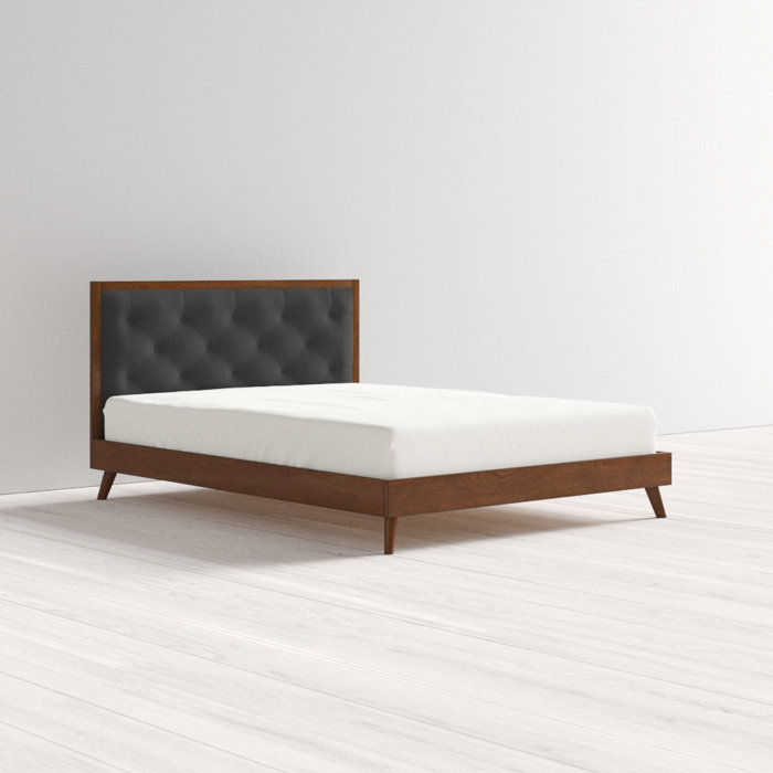
So, as you may remember, this was the room before. We loved our old upholstered bed frame (similar option here), but we had had it for a handful of years, and it felt like a good time for a change. Plus, it gave us the chance to sell it to someone who needed a great bed on a “Facebook Marketplace” budget!
This first room design was based around rich earth tones and high contrast textures thanks to layered rugs, creamy tasseled bedding, and wood furniture. We really loved it, but, like I said, it was just time for a change. Our goal with the refresh was to tone things down with a quieter color palette, and to get a bed that was lower to the ground to give the space a lightweight feel.
.jpg)
.jpg)
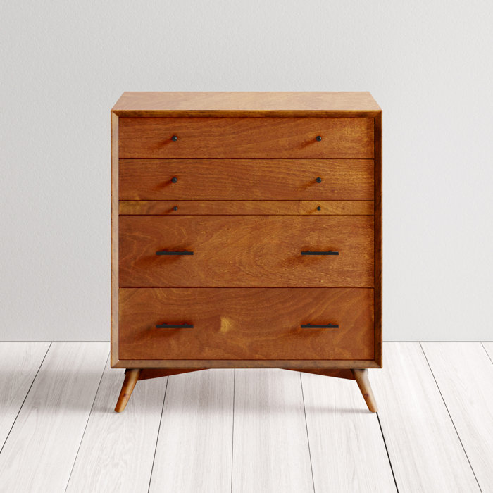
As for our summer 2020 transformation, we ultimately kept both of our dressers (the lower one can be found here, and the tall dresser was a handmade gift from my dad), as well as the old neutral bottom rug. On top of the latter, we laid down a larger but more neutral area rug that helped lighten the visual weight of the space in comparison to the dark red rug we had down before, which we later moved to storage.
.jpg)
.jpg)
.jpg)
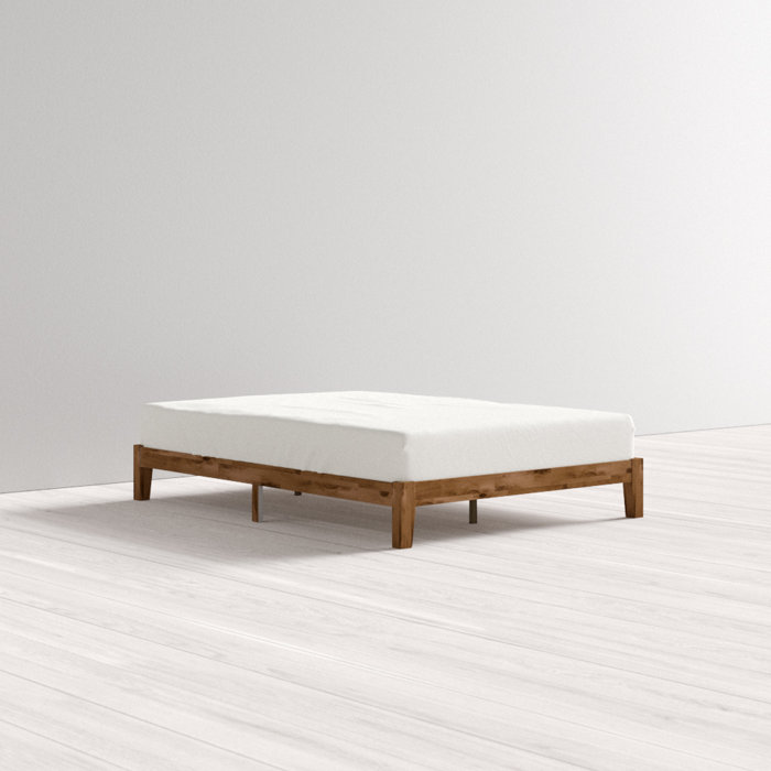
The bed was really the biggest thing we changed and I’m so glad we did, especially since we were able to find one that cost less than $175. The wood frame I chose has multiple wood tones running through it, which helps bridge the gap between our two dressers since they sport two different stain colors. I was able to put the bed frame together by myself, so that helped move this project along quickly, and I absolutely adore the lower profile. It feels almost weightless in the room when dressed with all-white bedding, and really pushed that “zen” vibe I was going for.
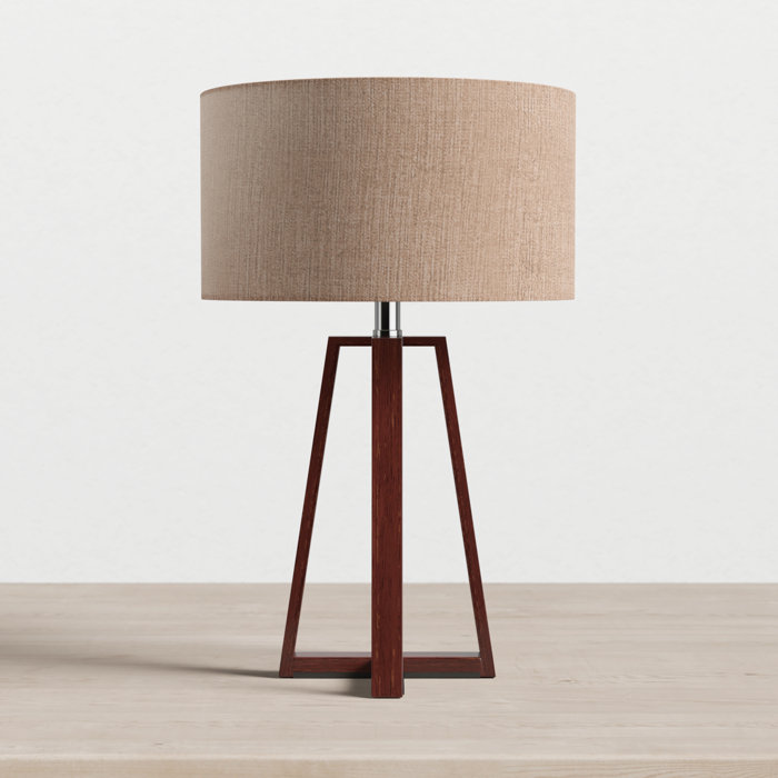
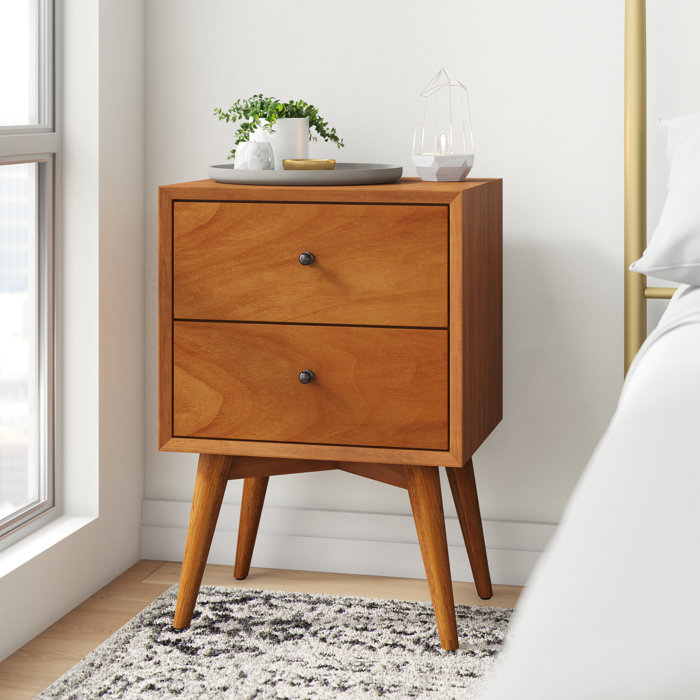
I actually moved the bed further over into the corner to allow us to enjoy more of that pretty rug pattern, but that meant I had to move our pair of vintage light-painted nightstands to another room. To replace them, I moved a single dark wood nightstand (another secondhand score) that I already had into the space, and topped it with a sculptural table lamp that combines more of those earthy tones I’m loving right now.
.jpg)
.jpg)
.jpg)
Now, to address the “headboard.” I’m putting that in quotes because it’s actually just a painted arch that I drew and painted right on the wall behind the bed frame! It’s the perfect little accent to give the bed a little more presence without having to splurge on a bed-frame-and-headboard in one. I’ll be sharing a full post all about how I DIYed that feature, so stay tuned.
The rest of the walls got a small makeover in terms of art, but most of what I used was sourced secondhand, came from local artists, or we already had it in storage in our basement. As an example, the line drawing is a new favorite that I downloaded digitally from artist Jan Skácelík and had printed by a local office store. I popped it into a wood frame that my dad built for me, and I’m smitten with how it accents that blank side of the bed. Another favorite is the arched mirror I scored on Facebook Marketplace that I leaned on our tall dresser.
.jpg)
.jpg)
.jpg)
.jpg)
.jpg)
.jpg)
So, there you have it! Our bedroom styled two completely different ways, both of which we love. Do you have a favorite between the two? I’m curious to know which one you’d choose to use as inspiration for your own bedroom makeover this summer, so let me know in the comments below. Oh, and feel free to keep scrolling for a list of linked AllModern resources in case you want to get the look of our new “zen” space in your home.
.jpg)








Hello! I love your striped cream/grey blanket on your bed. Is that fron Allmodern too? Are you able to share a lonk? Thank you!! 🙂
Thanks so much! It’s from Cultiver and can be shopped here. So glad you like it!