Source: decor8
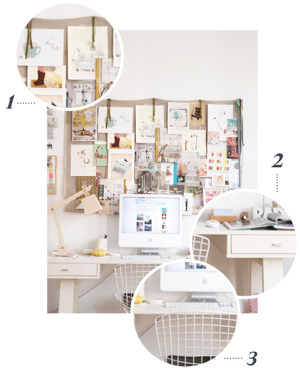
I’m continuing the “Office Week” theme here on DG-DIY with a truly spectacular desktop. No, it’s not a massive, storage filled, colorful work zone – The fact that it IS understated is what actually makes it such a magnetic space. It’s got a small footprint, but it somehow manages to be a space that I’m drawn to. I can’t speak for you guys, but I’d love to take a seat here and get creative. There’s just the right amount of color, plus there’s storage, but it isn’t overt. Let’s talk some more details…
1…I love this take on an inspiration bulletin board. The organic linen seems to be merely thumbtacked and draped across the wall, creating a great amount of space for inspiration but also making the purchase of a frame obsolete. It’s such a unique idea and requires little time and money. This is a fabulous solution – Wish I had thought of it!
2…By going with all white desktop accessories (and a white desk itself), this creative is giving his or herself plenty of visual room to breathe. The white scheme feels almost like clean negative space, even though there is actually a good amount of accessories to move around – dishes, a pencil cup, a computer, mouse and radio. By choosing that single neutral palette for the utilitarian items, the colorful IMPORTANT stuff (like the bulletin board inspiration and digital desktop) stand out and become the focus.
3…I hard core covet this desk chair. It’s definitely a throwback in terms of design, but the see through grid work allows it to sort of blend into the background – A space-saving tip we are all well aware of. Well…I’m AWARE of it, but I still need to keep reminding myself to employ the trick. If you guys find any budget versions online, let me know!
What are your favorite details?
For past “All in the details” features, click here.
P.S. If you haven’t already, click here to enter yourself to win 1 of 2 FABULOUS designer office collections for your own desktop!


