And now for today’s REAL post…As you may already know, I accidentally jumped the gun on a post I had been planning for a couple weeks from now. Oh well! Like I said, I knew it had to happen ONE of these days…If you missed it, check it out here, otherwise let’s move on to today’s “All in the details…” feature.
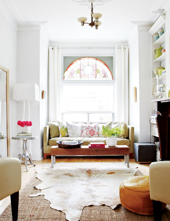
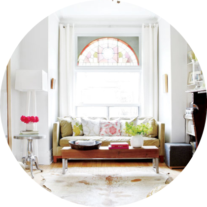
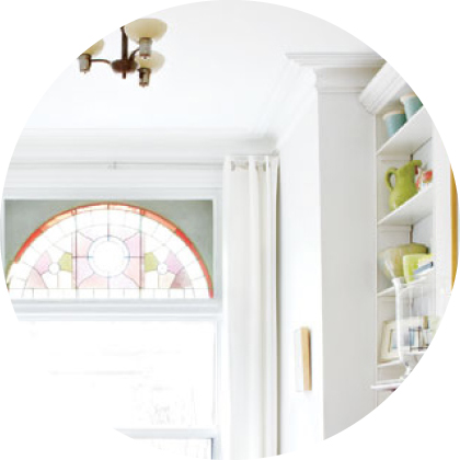
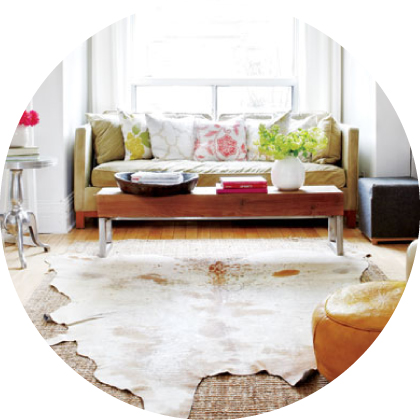
First things first – WOA, that light! The natural rays pulsating from the gorgeous stained-glass window pull me in, and the white walls soak it right up (yet another example to convince me just how good white walls can be). But aside from the light, the other main reason I chose to feature this space is the layered rugs. I am craving, treasuring, coveting the idea of an animal skin rug in our own house. Unlike some trends blazing trails through the design world (hint: chevron), the natural lines and organic feel of skin rugs has been a mainstay for ages and ages. This is one trend that will stand the test of time. But since these rugs tend to be a little low on square footage, I love the modern twist of laying it on top of a large-scale jute rug. Let’s talk some more specifics…
FURNITURE
How perfectly does that sofa sit in the window nook? Like it was made for it…Plus, the straight lines (a look you know I love) keep it from looking too cramped or unintentional. Although there’s a great mix of texture and material in this space, it’s all done in a cohesive way with subtle pairings. The metallic legs on the coffee table go with the silver side table. The wooden coffee table top goes with the wooden bases of both the sofa and ottoman. The black leather of the ottoman ties into the black legs of the two occasional chairs (in the foreground of the top image). And finally, the orange pouf carries through the honey tones of the coffee table and wood floors.
ARCHITECTURE
Stained glass, crown molding, built-ins, oh MY! Keeping all of the accent details a crisp, uniform white is something I would probably never have the restraint to do (as you saw in last week’s feature, I’m a sucker for color against white trim), but I DO love the way it looks here. So clean and fresh. While you can fake good architecture, I don’t think anything beats the real deal.
RUGS
As I said in the beginning of this post, I am head over heels for this layered look. Contrast in texture and contrast in shape make for this great feeling of coziness. While spending a little quiet chit chat time in the living room last night, I described the layered rug proposal to John and he actually seemed interested! I’ll keep you posted in case we adopt this look in our own home…
So what are your favorite details?
For all of my top inspirational spaces, click here.
P.S. My latest post for Burlap+Blue went live today. Click here for my tutorial on a “DIY Glitter Gourd,” just in time for Halloween. Oh, and you won’t want to miss the first half of the post where I explain the origination of that spectacular name…Hint: You’ll never guess who came up with it…
