It’s that time again! Time to virtually flip through a recent issue (no…not “the recent” as I just received a more current mag in the mail – They are too fast for me!) of “Better Homes and Gardens.” We are talking about the March 2012 issue, in case you want to join in the convo or want to flip along with me.
For those of you who haven’t been around for this feature before, I share some of my favorite features from the pages of this and my other personal subscription to “Do It Yourself.” I try not to give TOO much away because I always want to encourage you to pick up a copy (or a subscription) of your own. To field any thoughts of reimbursement for this shameless promotion, I must tell you that I make zilcho cash for these features. I just can’t help but gush a little, share the fun tips and (as always) do my best to help inspire you just as I have been!
So let’s get started…
“Color collision” – That just about describes my thoughts minute-to-minute. I am so in love with anything colorful. I’m that consumer product designers are catering to when they offer items in 9 different colors. There’s something so much fun about getting to choose a bright orange or red toaster in lieu of a plain white one. This page of “color collision” products caught my eye immediately. Yes please, I’ll take a bright yellow metal box fan – The retro look and design is enough to make me want to seal that deal. Or that stack of colorful potluck bakers by Crate & Barrel – The $30 pricetag for a set of three isn’t bad at all.
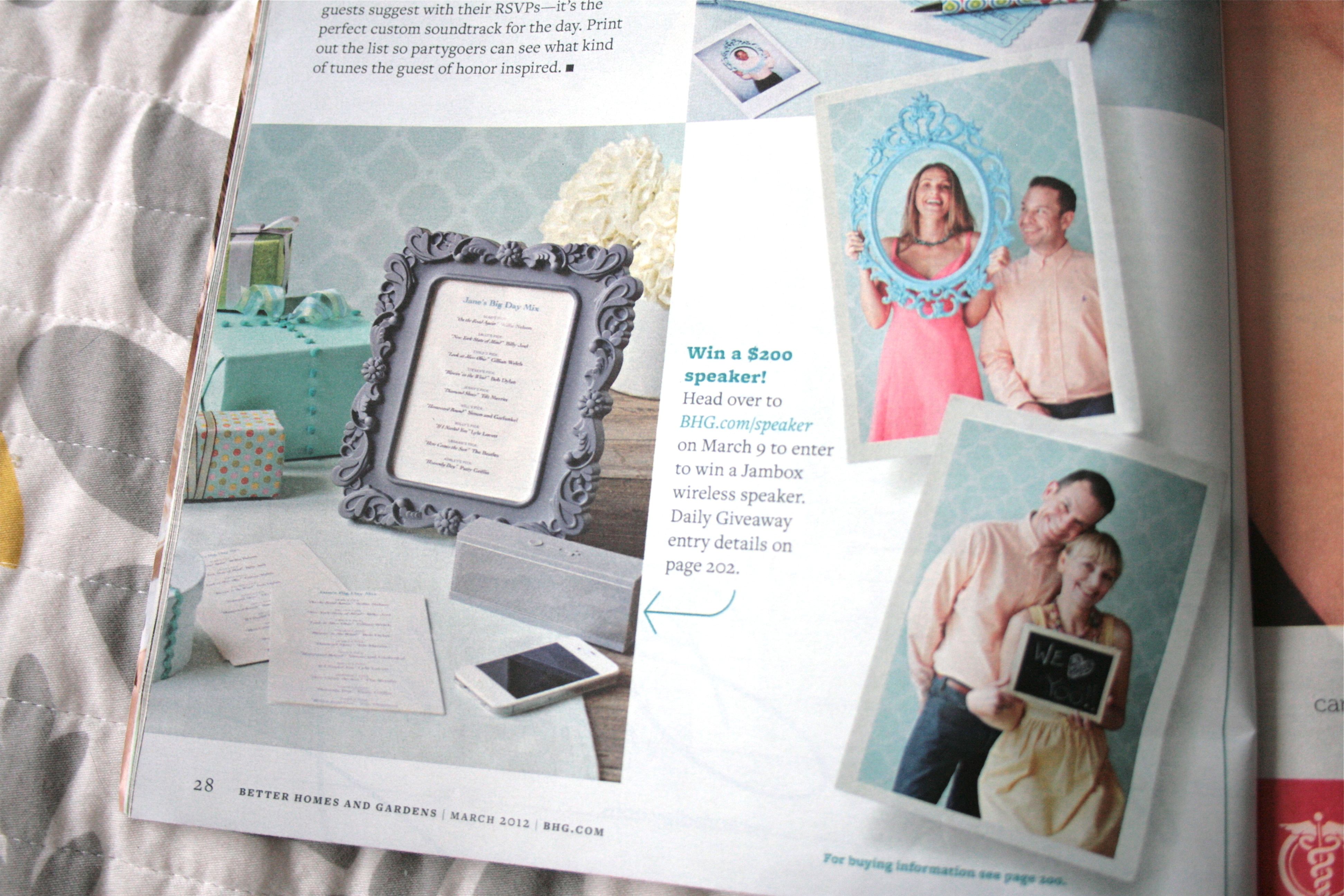
Moving on, I couldn’t help but spot this feature on how to throw a great “grown-up” birthday party. With my birthday in t-minus 18 days, I definitely paused for a moment to think about throwing a similarly swanky fete for myself. But then I remembered that we happen to be throwing a WEDDING 10 days later, and I had to wistfully think of next year…Or maybe one for John’s birthday in September!
If you want to throw your own bash, they offer suggestions like asking guests to contribute to a scrapbook – Provide decorative paper and tape and then let guests explore their creative sides by crafting a page with handwritten notes and well-wishes. The perfect sentimental gift for any birthday girl.
But any good scrapbook needs photos – Have a stack of empty frames and blank chalkboards for guests to use in a makeshift photobooth. Using a polaroid camera (like the one I bought myself last year) offers instant gratification.
As is the theme for this “Color made easy” issue, the magazine’s pages are full of deliciously rich, gorgeous color pallets. As it says below “nothing transforms a room – or a mood – like a shot of color.” Try out their array of four colors below in a living room, sunroom or even bathroom! If you think it’s too bold for you, give your walls a soft neutral and then choose two of the bold colors to use in accessories (think throw pillows, lamps, even a spray-painted picture frame).
Take this little seating vignette for example – Neutral wall and chair colors allow things like the patterns pillows and bright red rug to pop. Throw in some brass accents like the brass flower bowl and nesting side tables to add a little sparkle and pizzazz. (If you happen to click on those links, you probably noticed that the products used were a bit pricey – For budget finds, scour places like Ebay or your local thrift store instead)
Here’s a great spring-inspired color pallet to drool over – Misty Lilac (2071-70, Benjamin Moore), California Dreaming (B28-6, Ace Hardware), Agreeable Gray (SW 7029, Sherwin-Williams), Tin Lizzie (D42-4, Olympic) and Glazed Raspberry (120D-5, Behr).
Most of the home tours in this particular issue were a bit traditional for my mid-century mod tastes, but this one caught my eye because of the punchy color scheme. Just goes to show how you can be inspired by color no matter what the actual style of the room may be. I could easily pull some of the brass, rose and blue-gray tones of this space and use them in a more contemporary way.
Love those shimmery gold frames and the tray style coffee table. Oversized flower arrangements are another thing, like color, that can compliment any style.
The photos below are of another room feature with a spunky color pallet, this time a sunroom. It takes a brave person to paint both walls and trim in bright teal, but it works so well here. All of that saturated color is balanced out by pattern on the blinds, pillows and rug.
As if real-life rooms weren’t enough inspiration, their experts weigh in on the secrets to choosing the right color.

Here are just a few that got me thinking:
- (#2) “Look to the largest pattern in a room for inspiration. A multi-hue rug or a piece of art can hand you an entire palette.”
- (#10) “A client recently told me that my best color advice was to not give in to her ‘inner beige monster’ and to try soft blues, grays and taupes instead of off-white.” (Liz Levin)
- (#16) “When you think you’ve found the right color on the strip, go a step or two lighter. Pale colors are more flexible for pairing with other colors.” (Wish someone had told me that tip before I painted my studio…)
Here’s a quick spring-time DIY project for you – Grab some new natural foliage and lay on top of cold press board cut to the size of a frame. Then choose a bold color of spray paint and spritz over the foliage, leaving a fun impression behind on the paper. Allow to dry according to can instructions and then place inside your frame as art.
I love spring fashion…Bright patterned flats, skirts and dresses, oh my! The spread below features advice from fashion blogger, Lindsey Calla (SaucyGlossie.com), who even encourages getting stylish with your umbrella – Why the heck not?!
Besides their ALWAYS incredible selection of recipes…(like avocado and asparagus egg sandwiches and potato salad with sausage and grainy mustard dressing below)
…BH&G also featured a piece on how to eat better and follow healthy nutrition, something that John and I are alllllll about right now (as you may know from this post). Again, here are a few of the tips that caught my eye:
- To spend less at the grocery store, don’t skip the produce section. Fresh produce can often yield more servings than processed meals by weight and fill you up more efficiently. But don’t buy more than your family can eat since spoiled food is as good as throwing your money away.
- When you crave the cupcakes at your next office party, it’s likely that you aren’t filling yourself up aquatically throughout the rest of the day. Snack on healthy things like a salad or grapes to curb your cravings in the afternoon. It’s a mental thing too. Ask yourself if you really want the treat and, if you do, try just a small sample instead.
- Some things to watch for when going out to eat – Consider ordering a sandwich on whole wheat toast, if food is topped with sauce ask for it on the side and use sparingly, order vinaigrettes on the side like you would any other salad dressing as it’s not quite as healthy as restaurants make it out to be.
Hope you enjoyed our magazine chat. Anything you are inspired to try out? I think that I am going to give some thought to my color choices based on the info I read. I tend to go super bold on the wall color and on the accessories. For my next room redo, I’m contemplating a neutral on the walls to let bright accessories do the talking.
Hope you have a great weekend! I am actually taking the day off today to enjoy a little pampering with my make-up artist for the wedding. We are doing a trial to get a good handle on how I want to look on the big day. With my face all done up professionally, I am off to Charlottesville in the afternoon for the bachelorette party my work friends are throwing for me – Let the good times roll…


