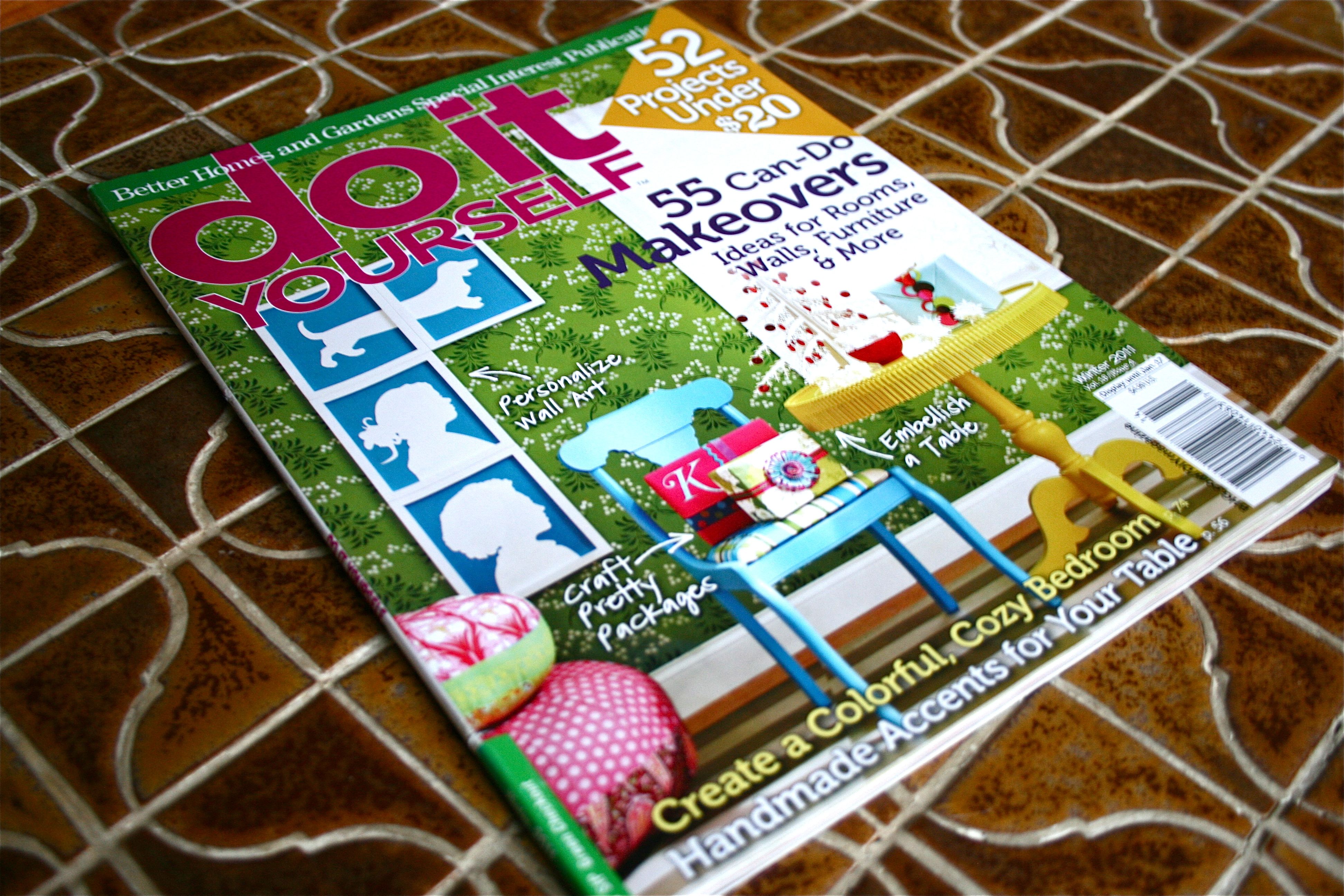
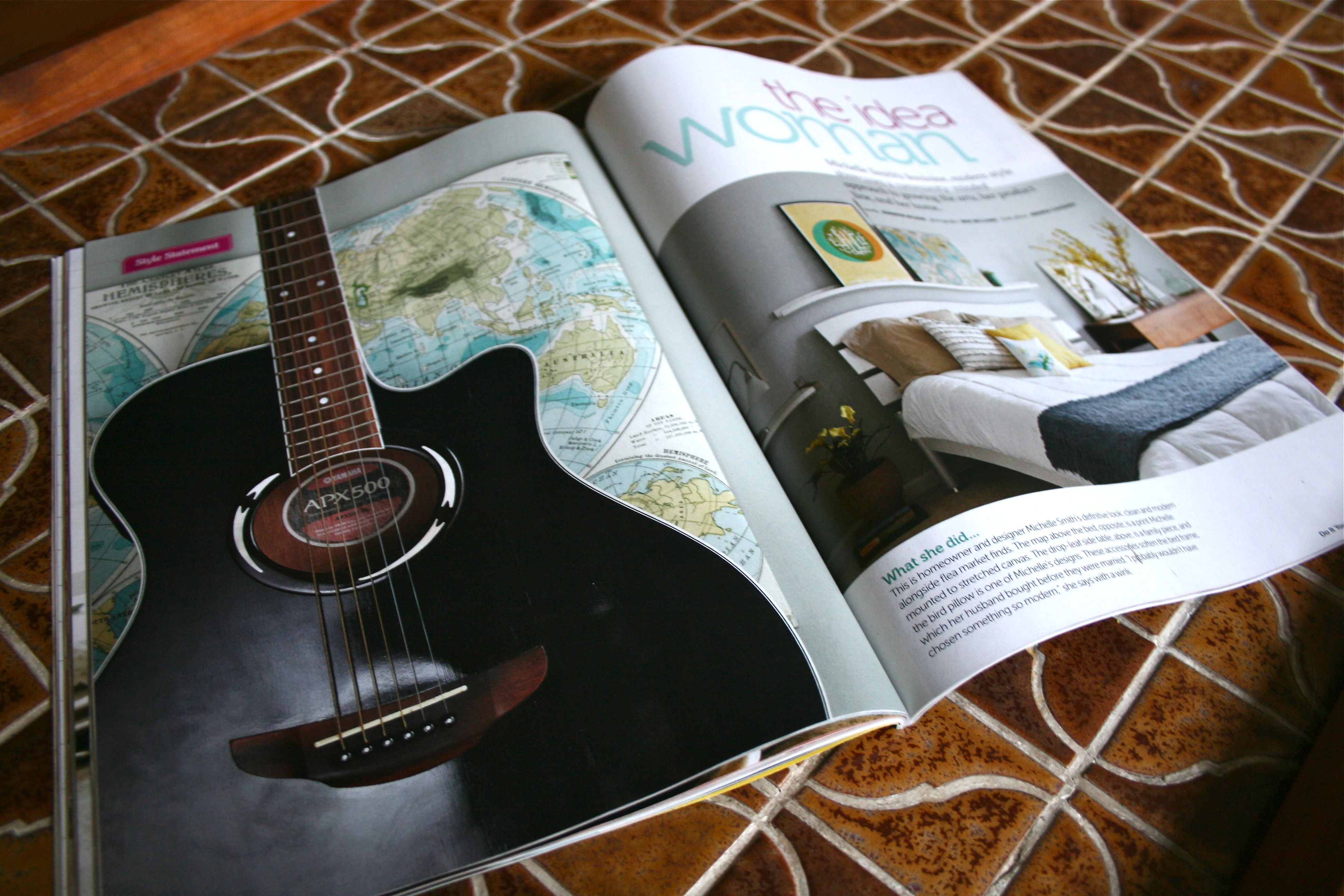
We are back with another virtual flip-through of the latest “Do it Yourself” magazine. Oh, how I love getting this glossy mag in the mail…I think John is keenly aware by now that I greatly enjoy this magazine – The dead giveaway is probably the immediate jumping up and down every time he brings it in from the mailbox. There is just SO much inspiration between the pages – I easily get sucked in for thirty to forty-five minutes of hard-core perusal.
As is tradition for our “Mag Tag” feature (see others here and here), I am opening the pages to let you in on the projects and features that caught my attention. If you like what you see, I highly recommend grabbing your own subscription – They have no idea I’m promoting their publication, but the geniuses behind “BH&G” (a.k.a. Better Homes & Gardens) and “Do It Yourself” make it worth the money.
Let’s get started!
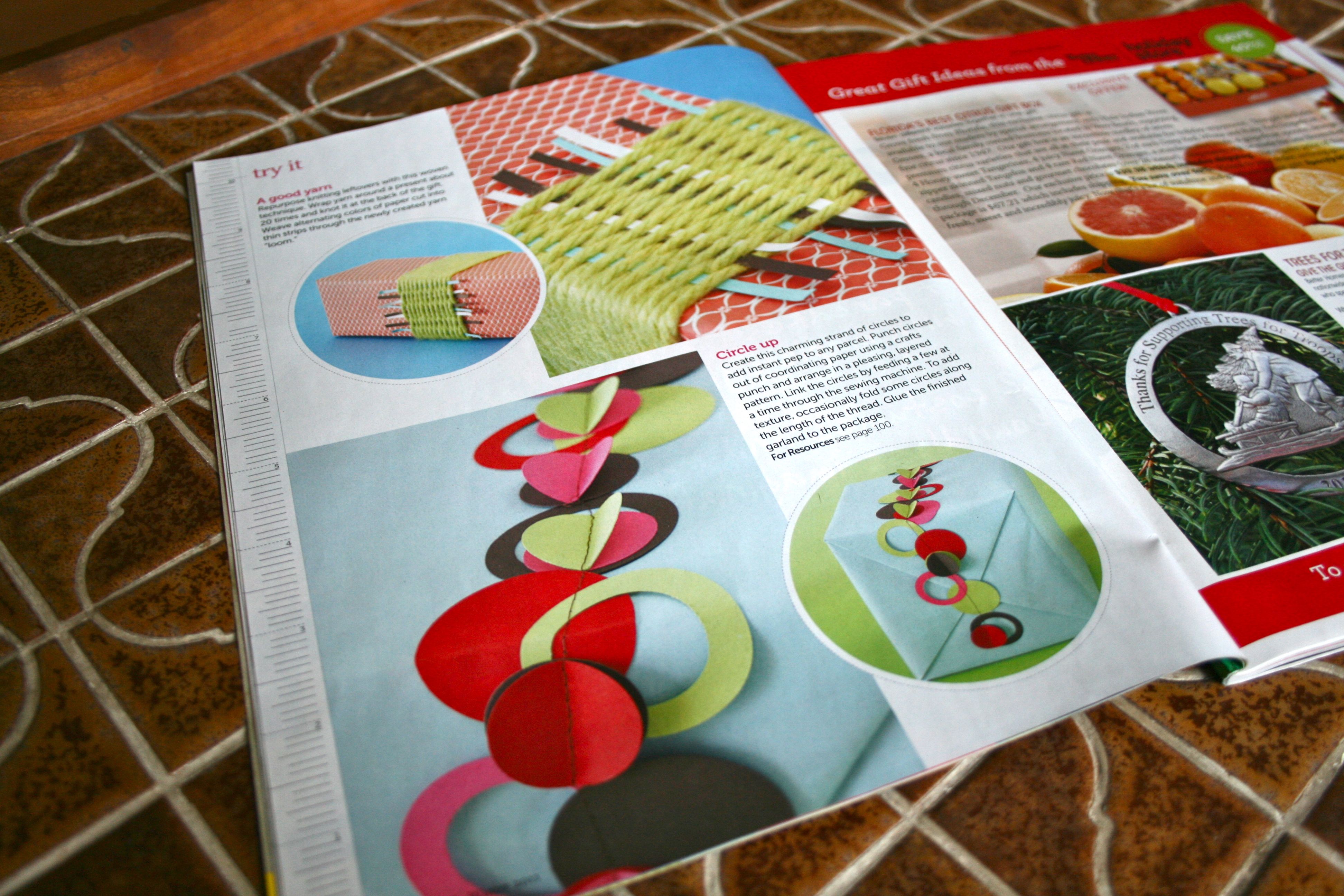
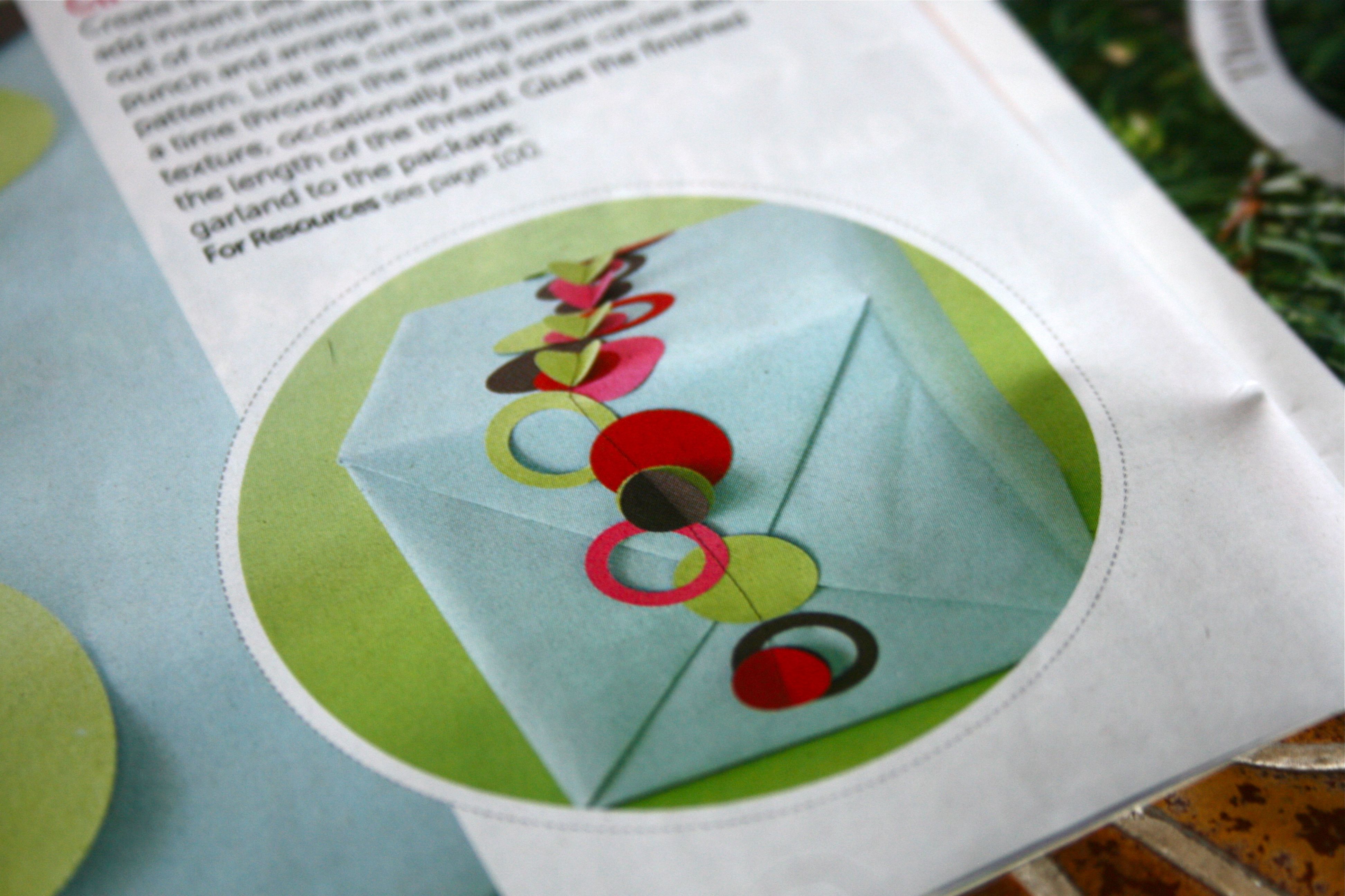
With the holidays right around the corner, I loved seeing these easy-but-effective ways to dress up the wrappings on Christmas gifts. I JUST started my Christmas shopping on Monday and am already excited about the wrapping phase. I think clever, colorful wrapping makes gift-giving all that much more fun – I know I’d love to see something like these beautifully decorated boxes under the tree! (but no pressure, mom) 😉
This one below involves breaking out the sewing machine. I do not own a sewing machine and I sorta doubt that I ever will – But for those of you who DO, or if you have a generous friend willing to let you crash their sewing space for an hour or so, this could be just the ticket for a festive “outfit” for your gifts this season. You simply run a straight stitch down the length of paper with little paper circles and “o”s laid across in a line. For a little 3D effect, fold up a circle every few inches or so.
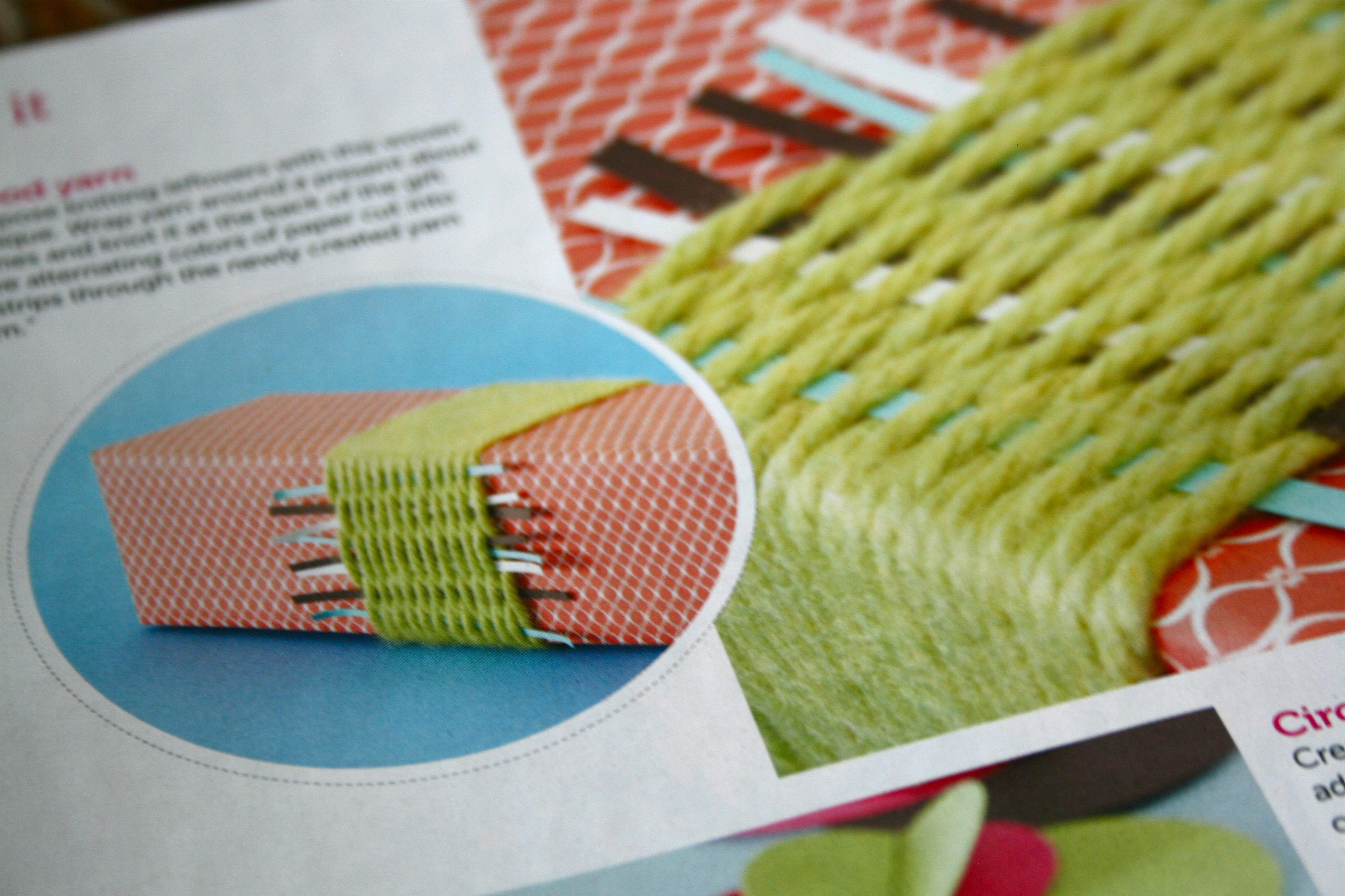
For this next option (something that may be a bit easier but no less adorable), try wrapping a pretty color of yarn around the box a dozen or so times, and then weave thinly cut pieces of decorative paper over and under the yarn rows.
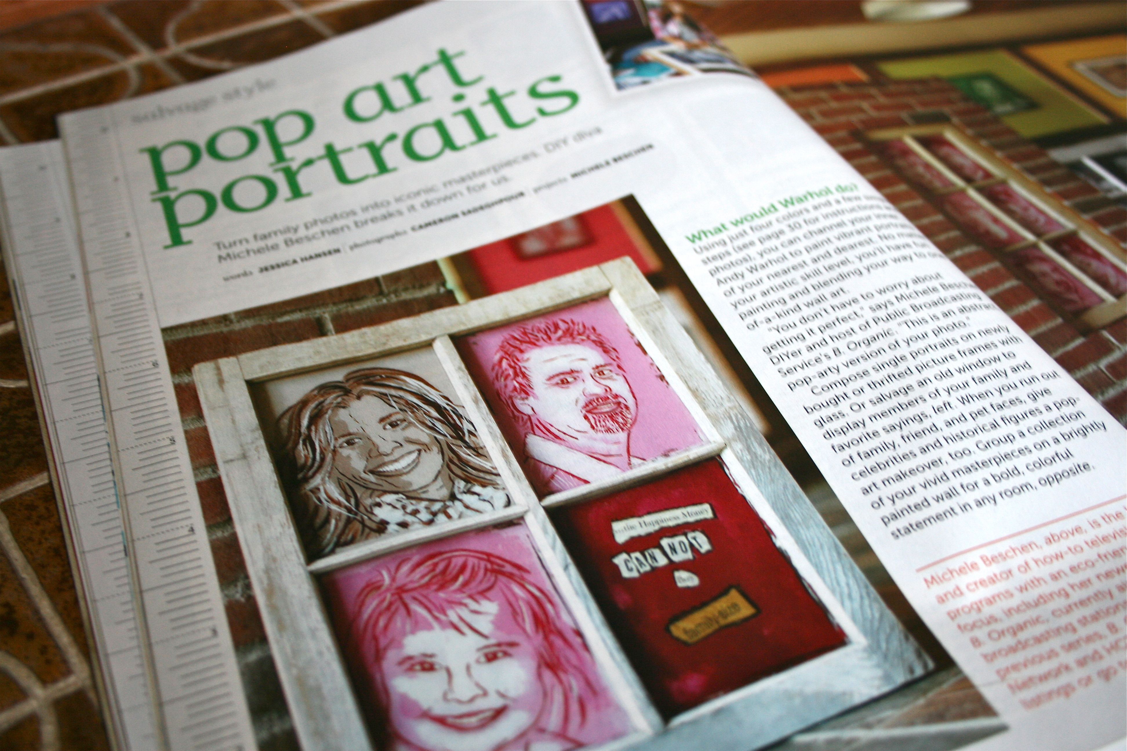
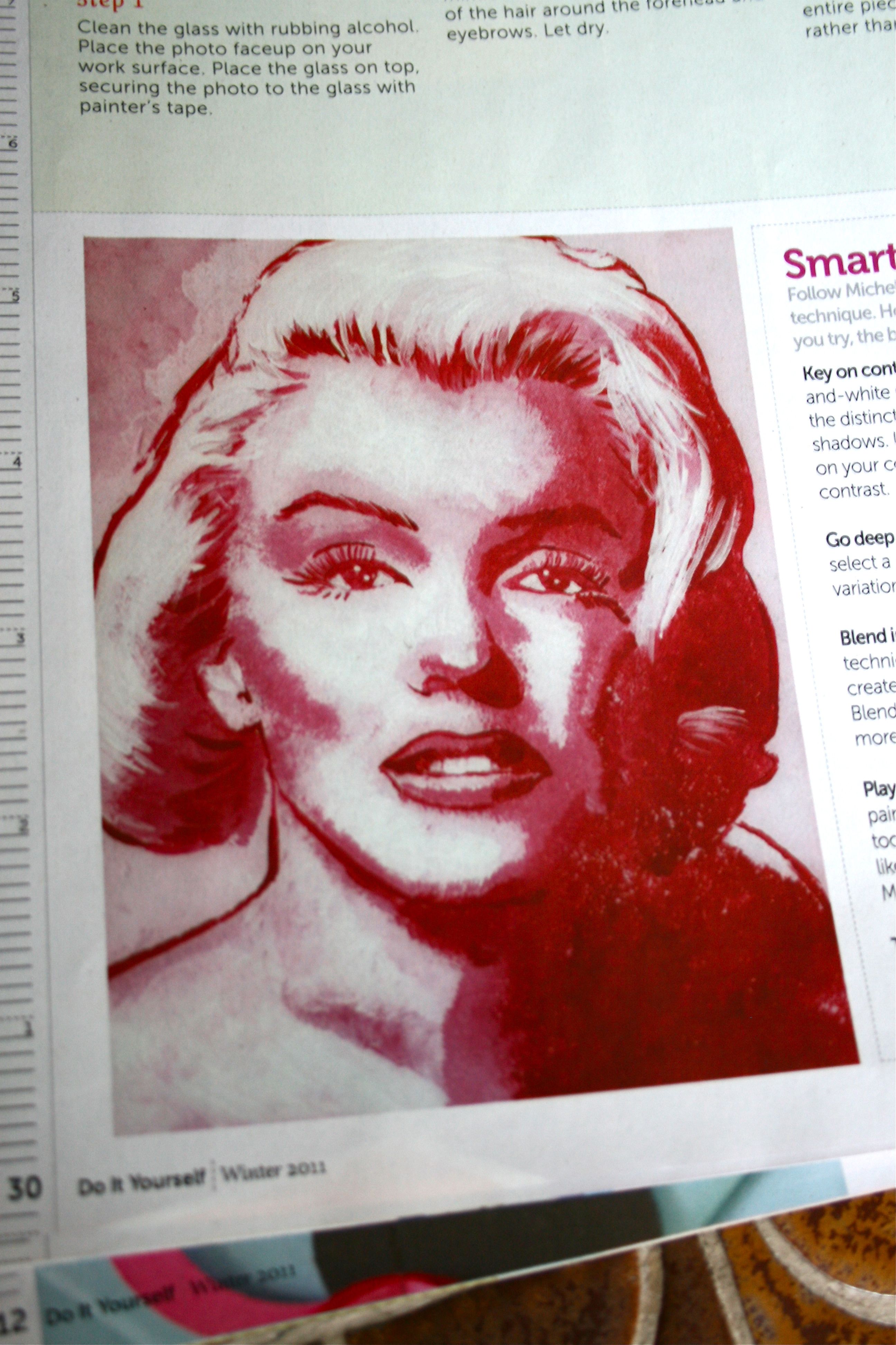
This next project involves breaking out the mod artist in you…A throwback to Warhol’s iconic paintings of Marilyn, Elvis and Campbell Soup cans, these DIY pop art portraits are a fun way to capture the faces of your family and friends.
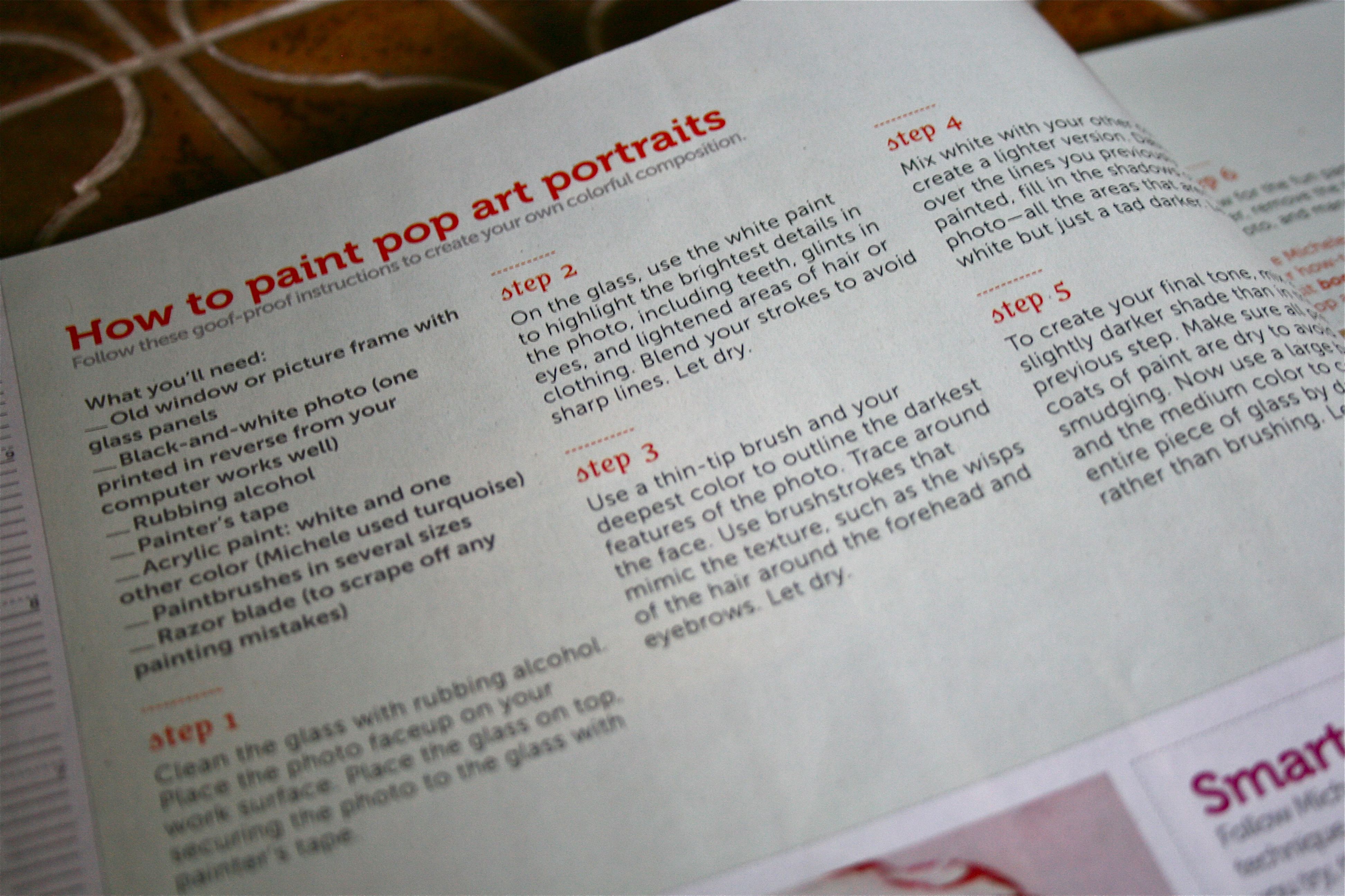
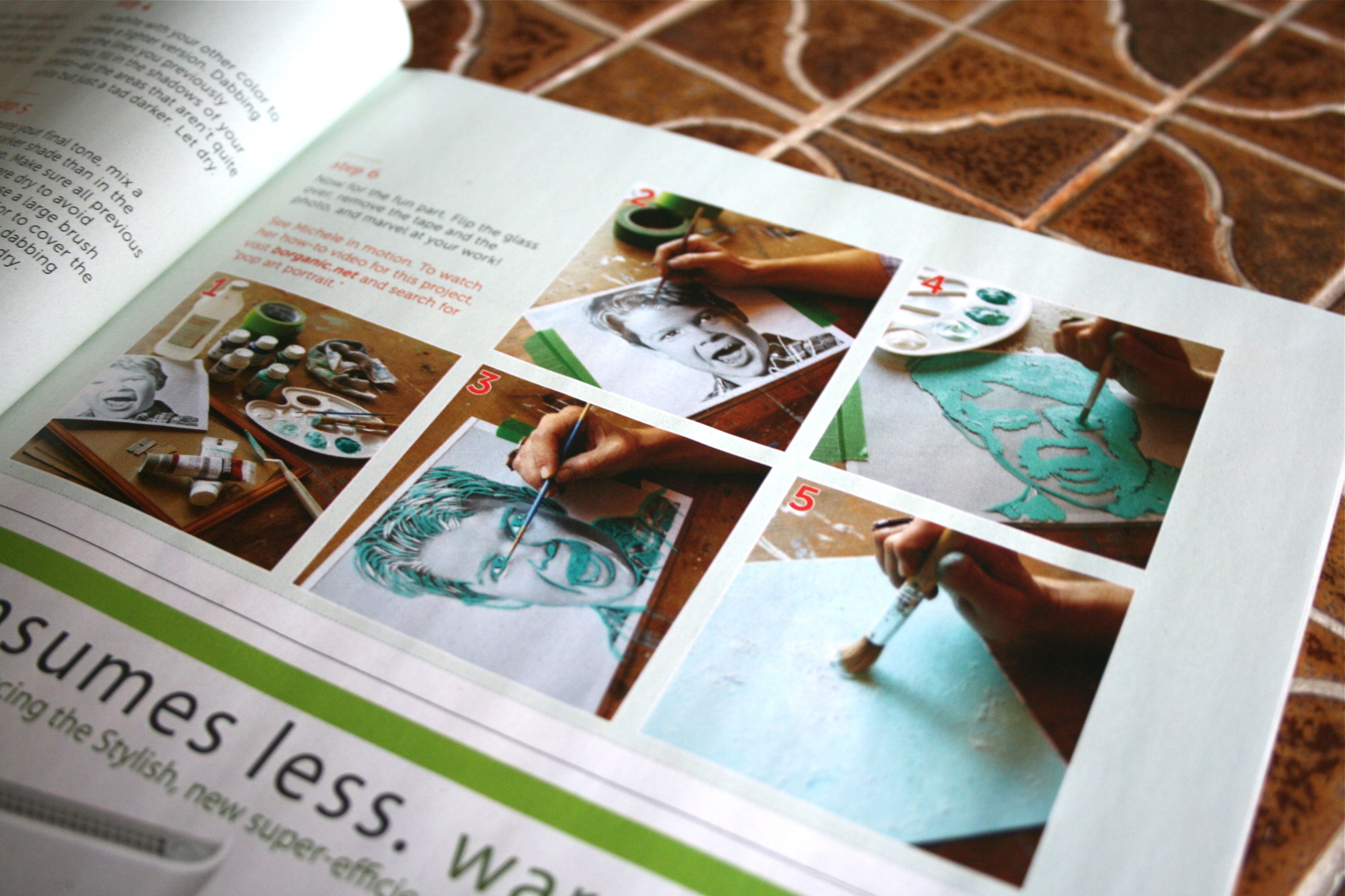
The steps are a bit involved but, if done as instructed, you should be able to get a professional-looking piece of art to hang in your home. Essentially, you find a piece of glass (try grabbing an old window from your local salvage yard/store) and tape an enlarged photo of your subject to the back. Then just layer your color in varying shades of dark and light, using the photo as a tracing guide. When you are finished, you’ll be left with a solid color – Don’t panic though because, after you flip the glass over and remove the taped photo, you will reveal a beautiful unique painting!
A REALLY neat effect if you have the patience and steady hand to try it out:
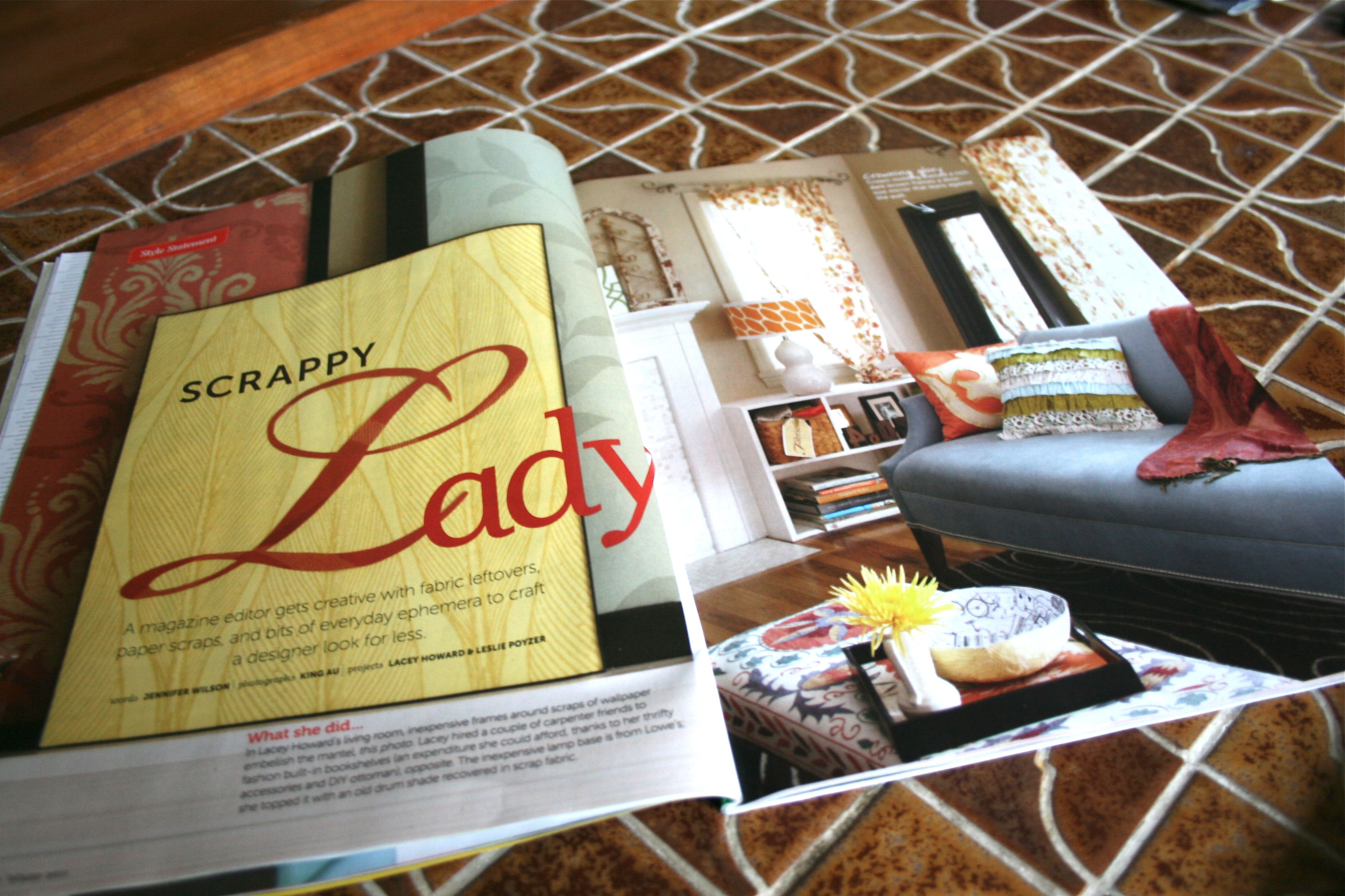
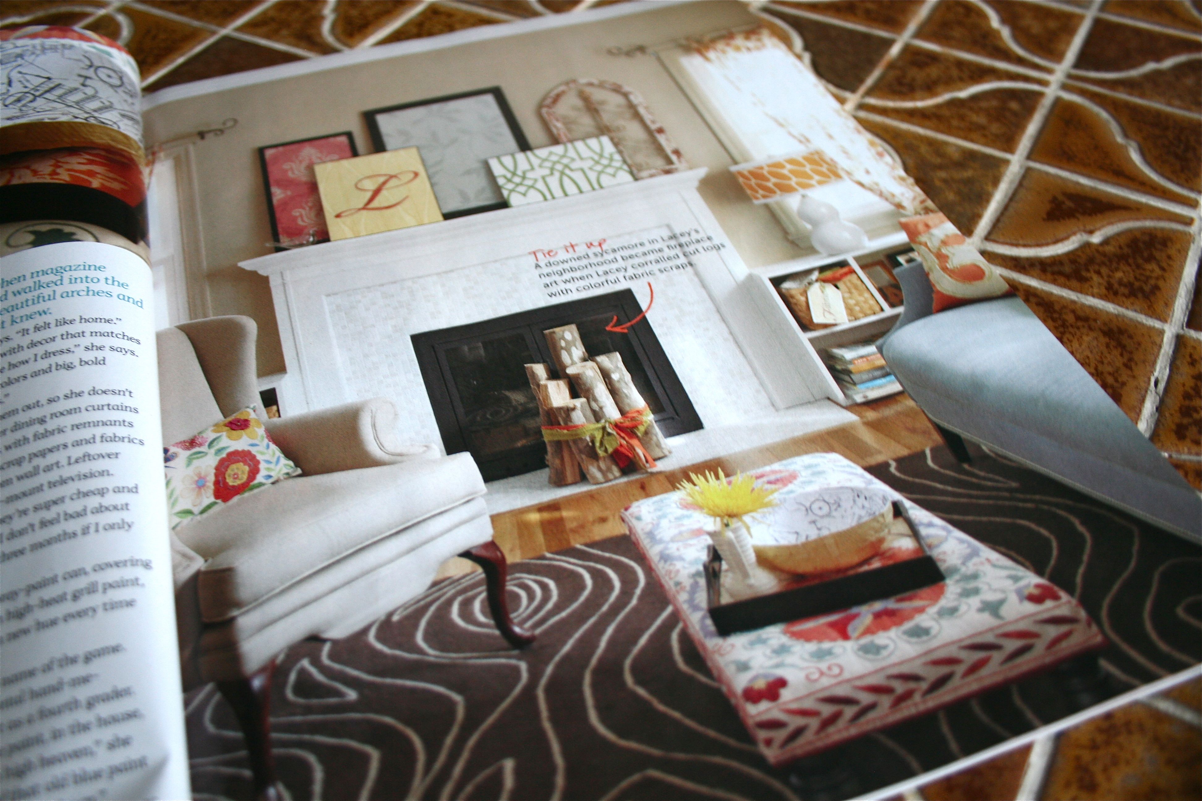
I l-o-v-e the room spotlights that “Do It Yourself” magazine prints…There were two that really stood out to me – This one below is just so sweet and feminine with warm colors and patterns sprinkled throughout.
I adore the rug (looks sort of like wood grain, which I’m really into right now for some reason), and the canvases and framed designs leaning on the mantel above the fireplace is gorgeous. I love the layering. Just an all-around beautiful space that I would love to copy someday.
This is a little product shout out that I thought might be of interest to someone doing a basement renovation. Stovetop+sink+fridge+cabinet storage = one PRODUCTIVE appliance! How cool is that? If you are looking for the function of a mini kitchen without the cost or space-hog, try this compact kitchen from Avanti Products. The $599-$699 price tag sounds a little scary, but you could probably only get a stove and fridge for that price (if you’re lucky). Could be just the ticket for your space!
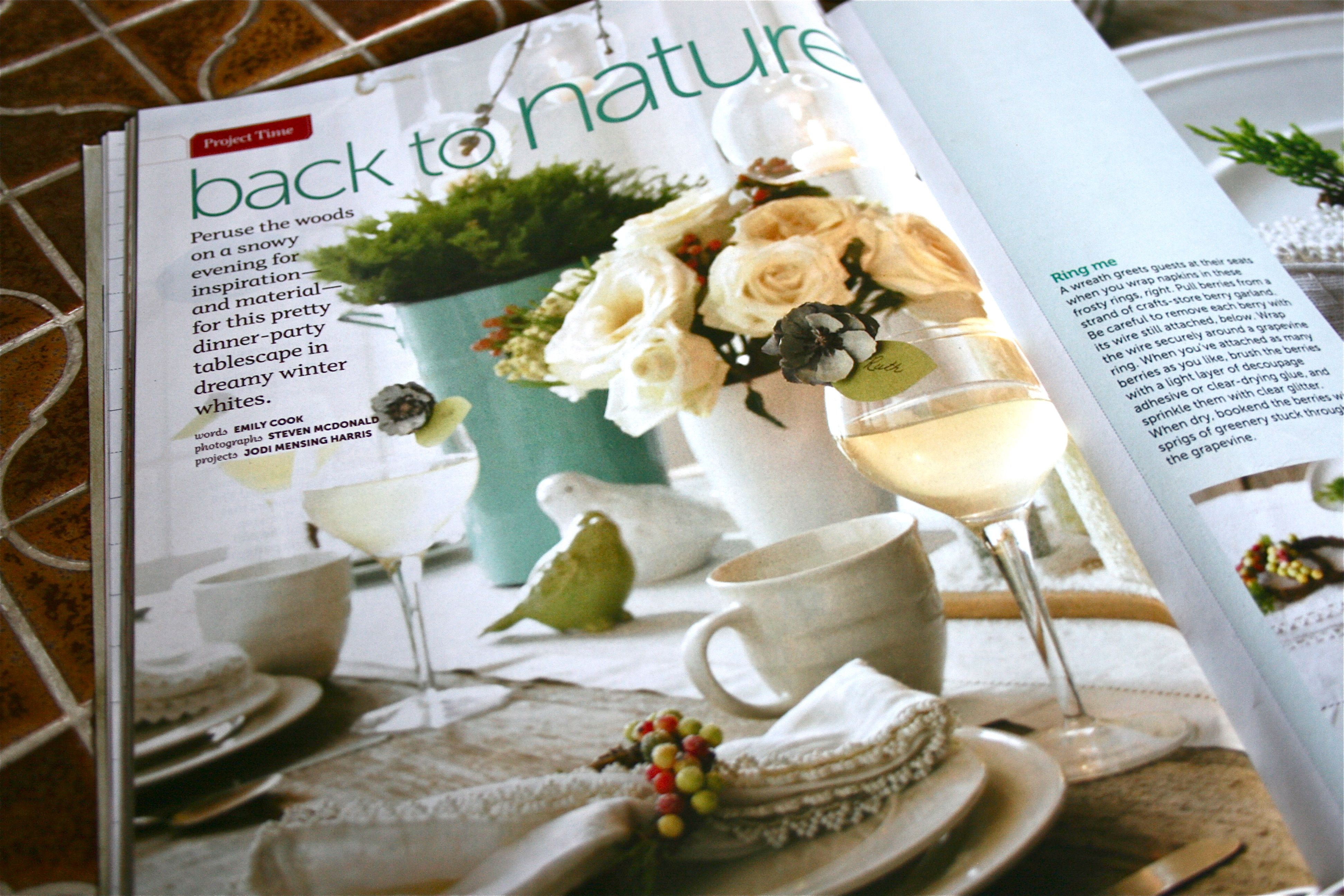
In preparation for the holidays, this “Back to Nature” table decoration feature caught my eye. I love the idea of bringing the outdoors in, especially during the cold winter months when outdoor activity may be limited. Plus, natural decor is often FREE – Can’t beat that.
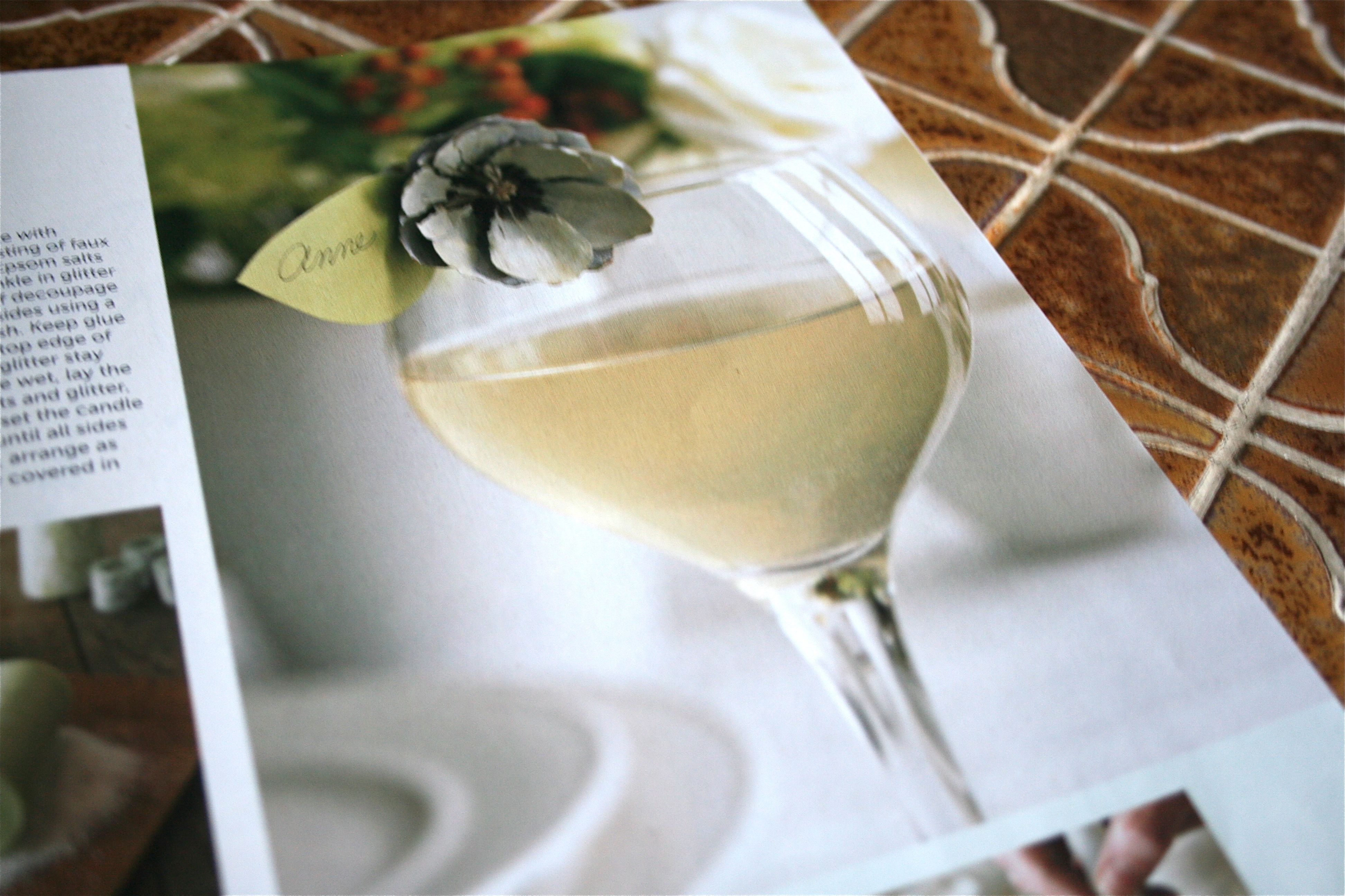
When I first flipped to this page, I thought “What a sweet little faux flower bud on the rim of that wine glass!” – Then I did a double take after I read on to find out that it’s actually made from a pine cone!
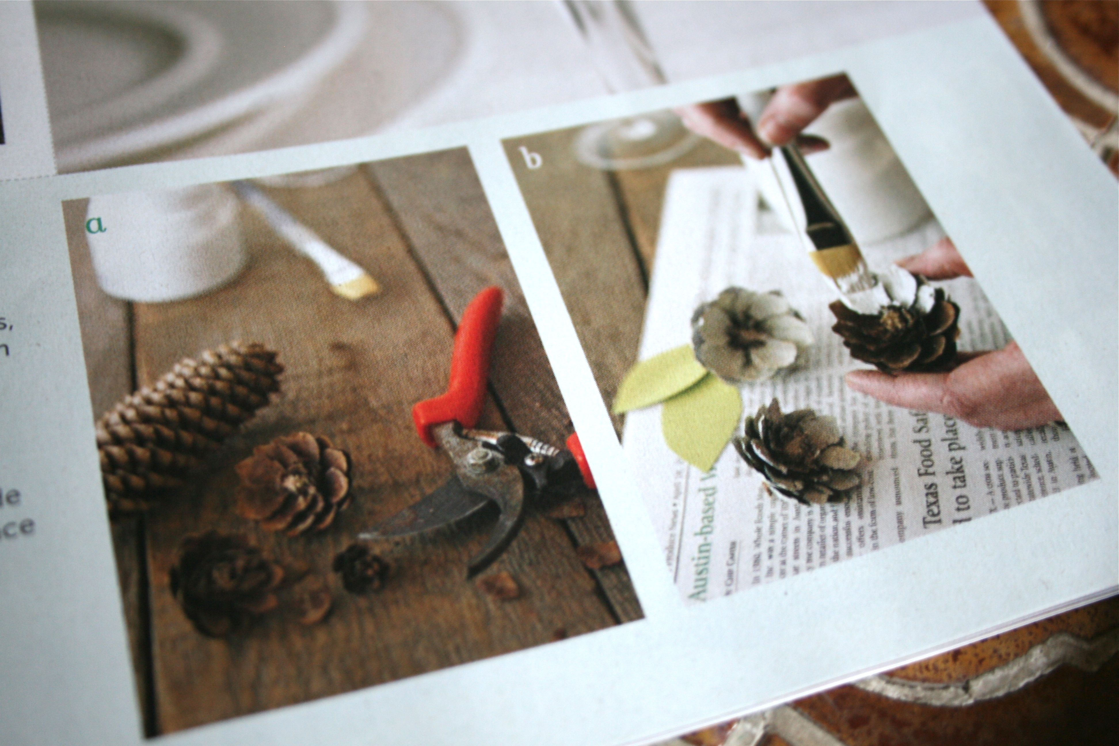
All you do is snip off cross sections of a pine cone using sheers and then paint the “petals” of the snipping. So simple and so free if you have an evergreen nearby (the odds are pretty good on that one) – Even if you don’t have a handy supply of pine cones available though, they are often sold inexpensively at your local craft store. BONUS: Slip a piece of green paper cut to look like a leaf into the pine cone “petals” and use as a place card for guests at your holiday party.
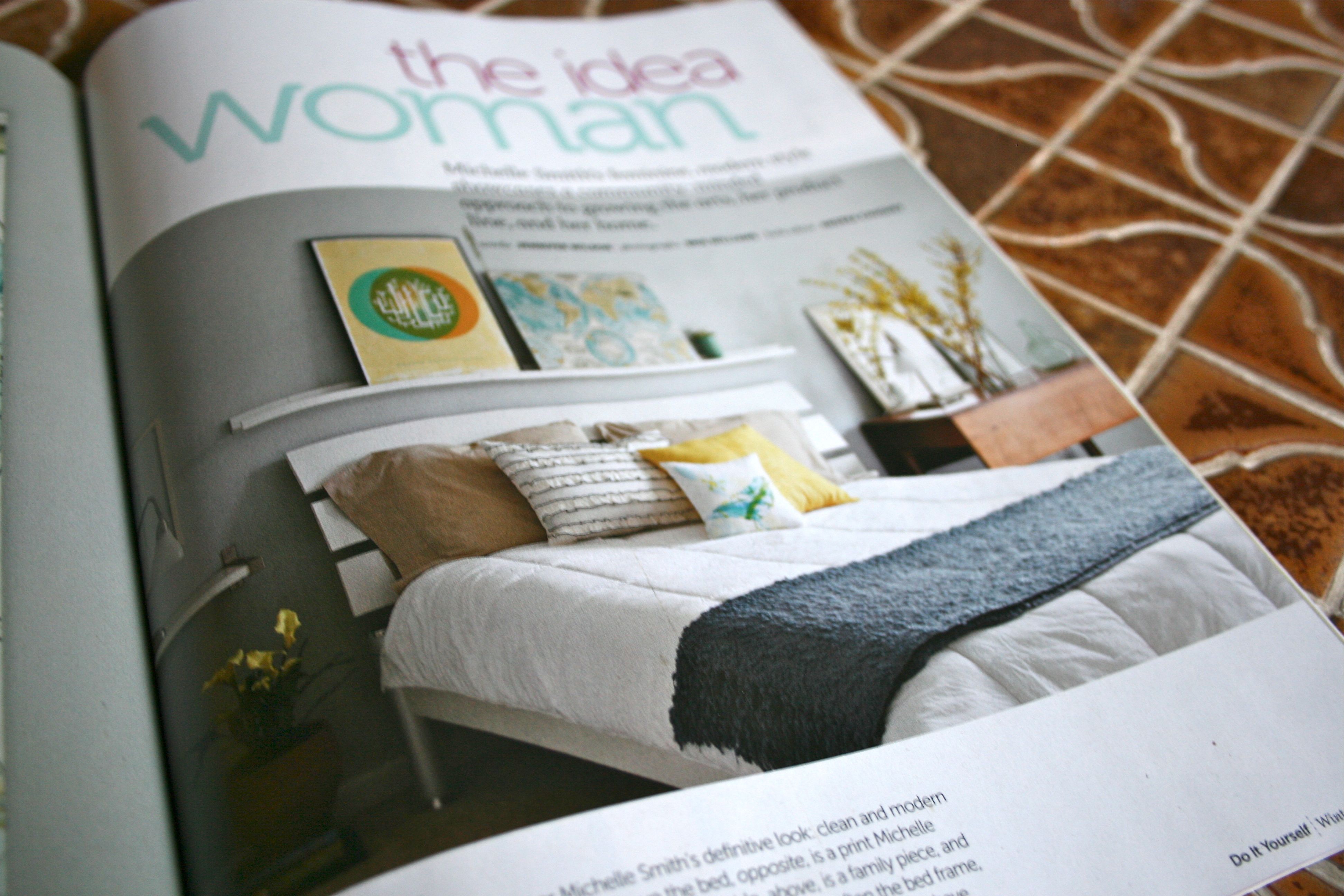
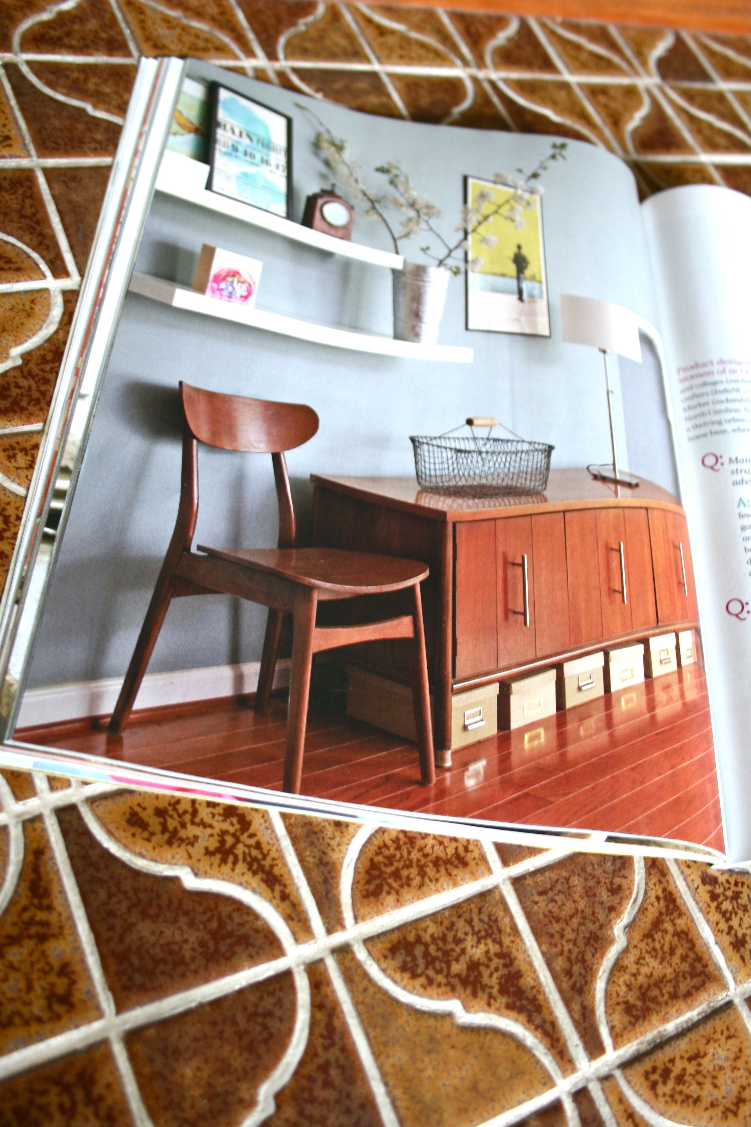
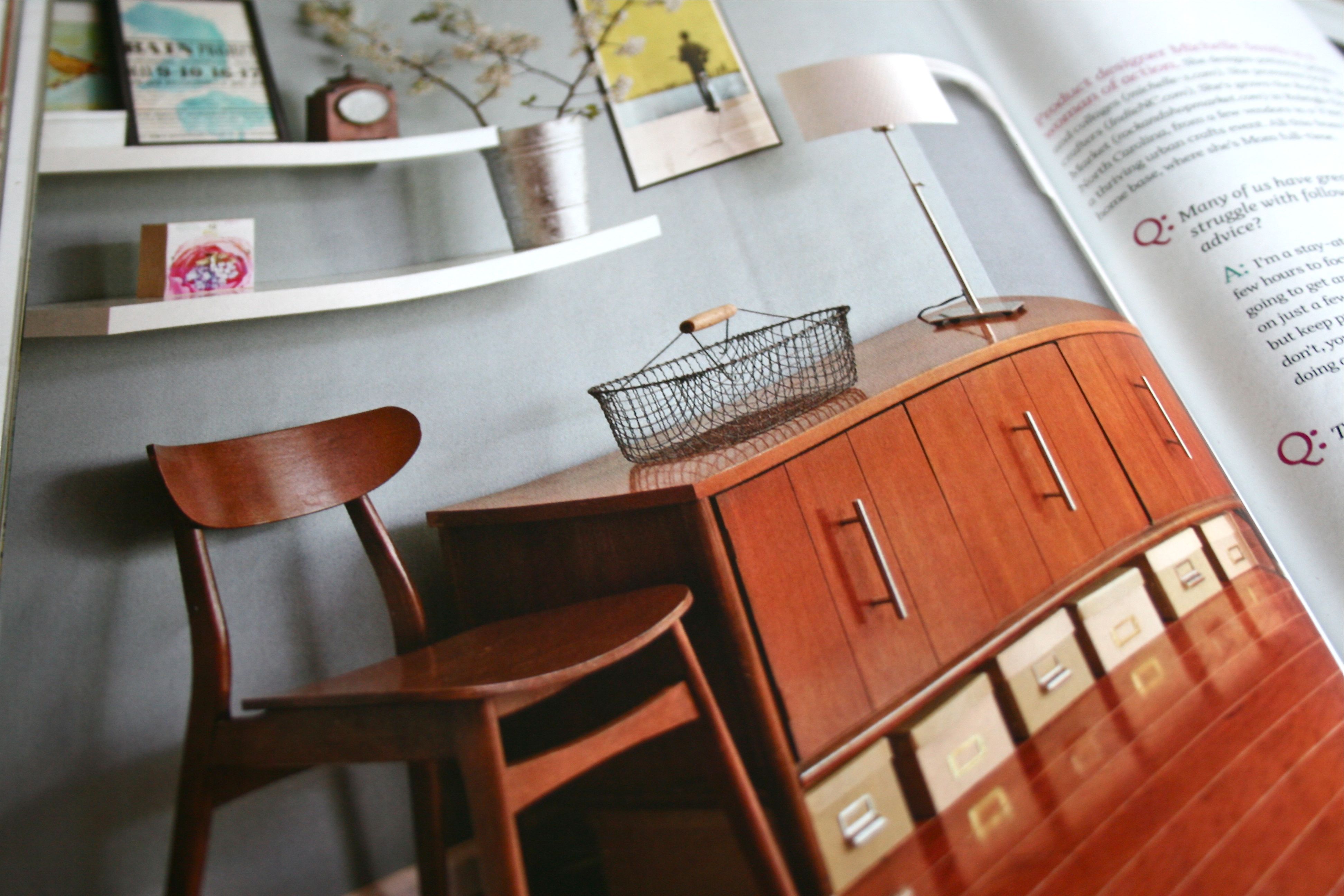
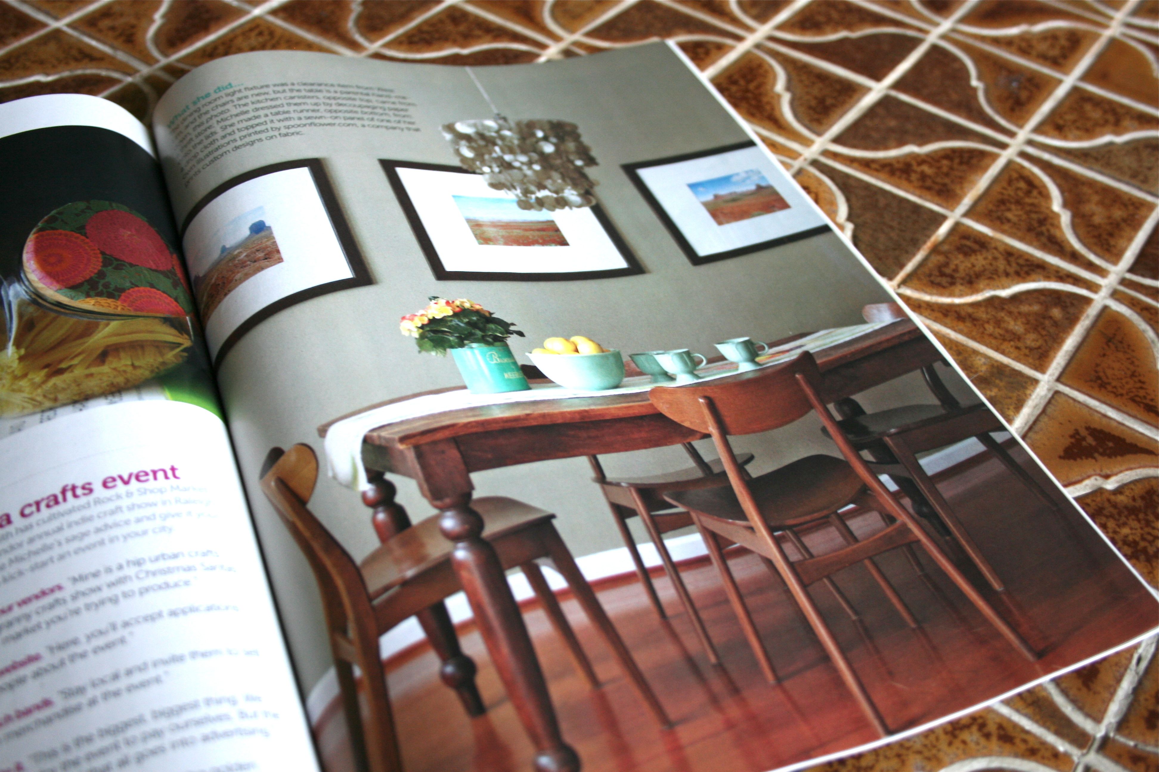
I said earlier that two home features caught my eye in this issue…Well this next and last one is my absolute favorite. I got way too excited when I saw all of the mid-century furniture, cool-toned colors and wood. I want EVERYTHING in this spread and might have drooled on my copy of the magazine as I scrutinized every detail…
This reminds me SO much of our master bedroom, with its gray paint on the wall and white acrylic bed frame. I’m thinking a plain white bed spread might be a good idea for OUR bed now! Don’t worry though – Our gorgeous (if I do say so myself…) quilt would still be folded up at the bottom of the bed like in this inspiration image:
I die – Look. At. That. Buffet. And the chair! And the pop art! And vintage clock on the shelf! ::heavy happy sigh::
Someday…Even though I think we are fairly close with the TV stand and plethora-o’-thifted-clocks in our living room. One thing I am definitely going to try out in this shot is the photo boxes under the buffet – What a great way to (1) add extra storage and (2) hide the cords and cables that are always visible under our TV cabinet.
And HELLO I love the dining room set below!!! More grey walls, more of that mid-century vibe in the chair legs, the fancy sparkly metallic chandelier…Needs nothing more to be perfect. I am definitely tearing this entire spread out and keeping it in my our next-house-design-inspiration folder.
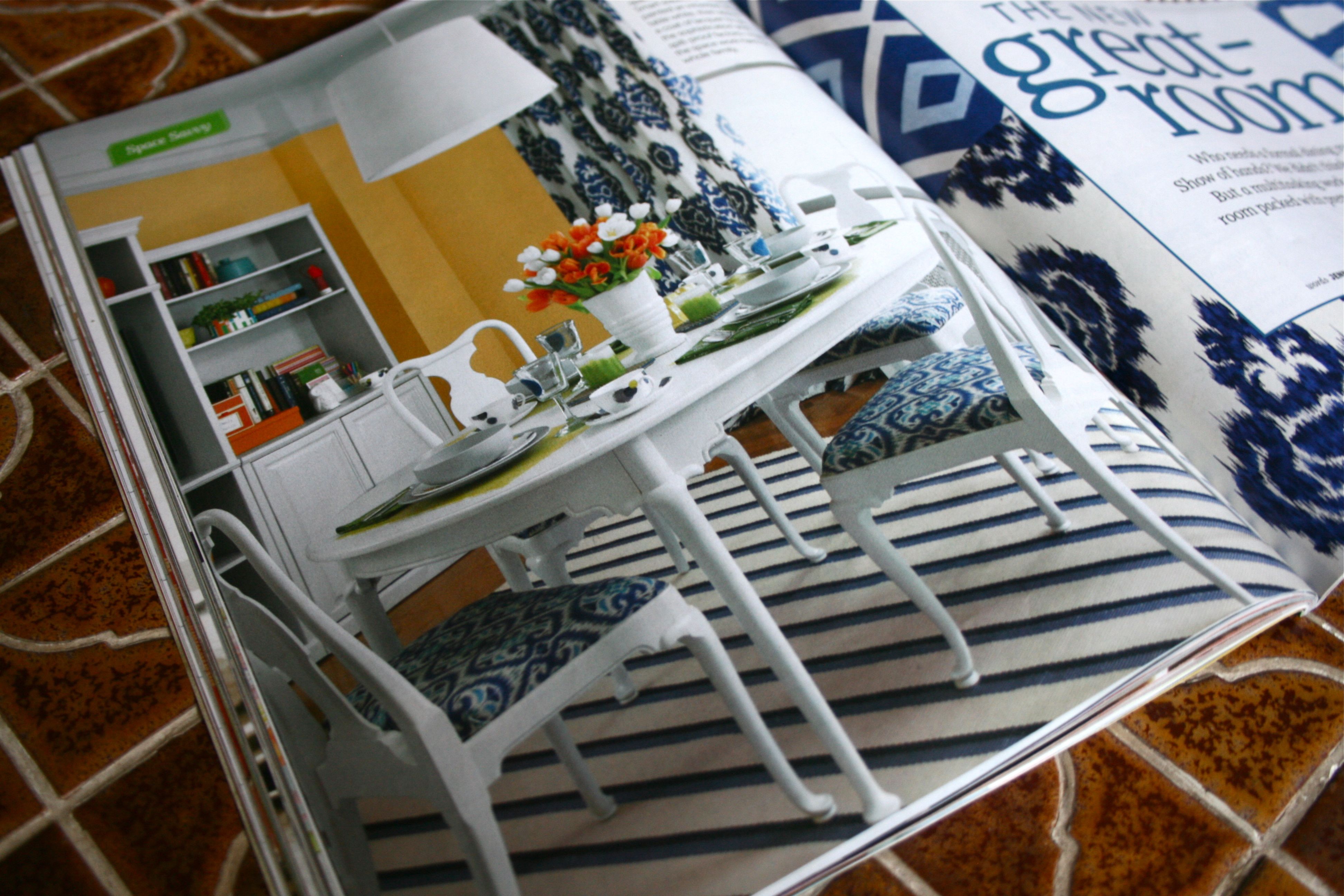
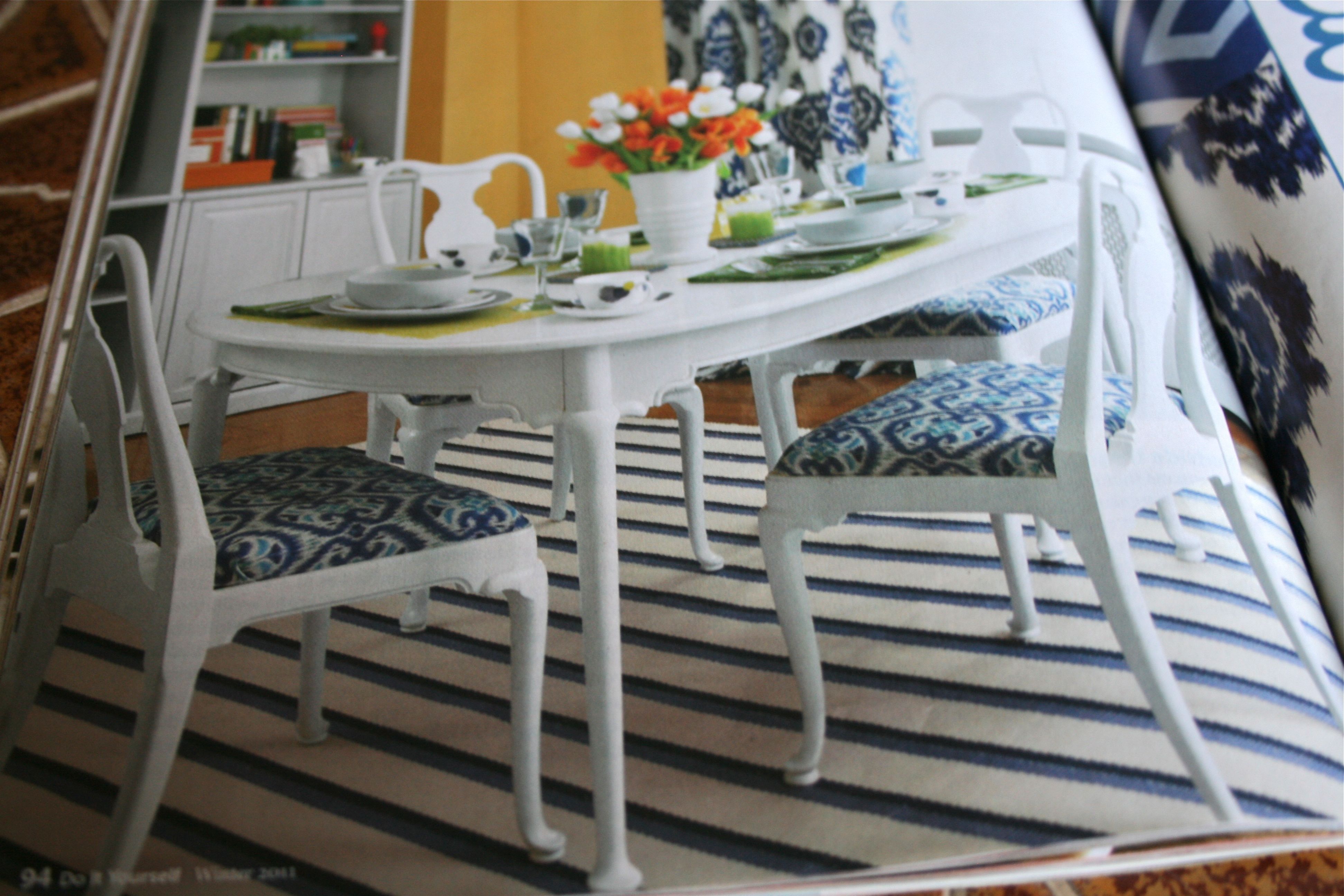
Speaking of dining room sets though, here’s a fun idea I came across towards the end of the magazine. It’s an older, more traditional set painted in a high gloss white finish. The white really modernizes it! If mom ever pawns her old dining room set off on us so that she can upgrade, I’m totally going to do this to it. And the fun ikat fabric on the seats is the cherry on top.
So those are the highlights that jumped out at me as I flipped through the latest issue of “Do it Yourself” magazine! Hope you enjoyed it and got a little inspiration too. If you want more, go grab it from your nearest Barnes & Noble – Your home and your furniture will thank you for it 🙂
