TGIF!!!!!!!!!! Or in my case TGITEOTCWW (i.e. “Thank God it’s the end of this crazy work week!”) – Yup today is the last day of my current HR position. Don’t get me wrong, it’s been a wonderful experience and I will sorely miss the amazing ladies in our small 4-person department. But it’s time for me to move on…I am FINALLY moving into a more creative-based journalism position with our local newspaper and, although it’s a risk and basically starting over, I’m excited to see where this new opportunity takes me. My first day at the newspaper is Monday, so I will be sure to let all of you who actually care (and I guess those of you who don’t too) how it went!
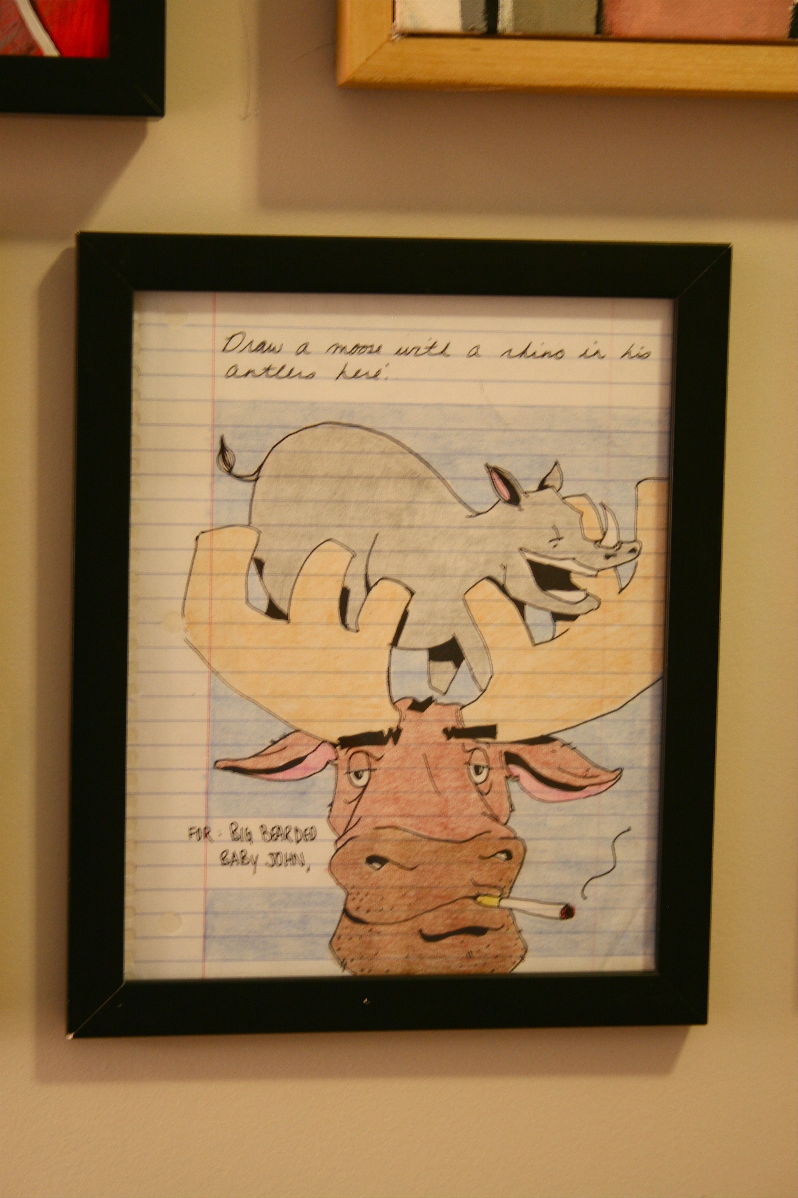
But back to DreamGreenDIY projects…So as promised on Tuesday (namely involving a strange drawing of a moose and a rhino), it’s time to unveil a little art project that we tackled in the upstairs hallway.
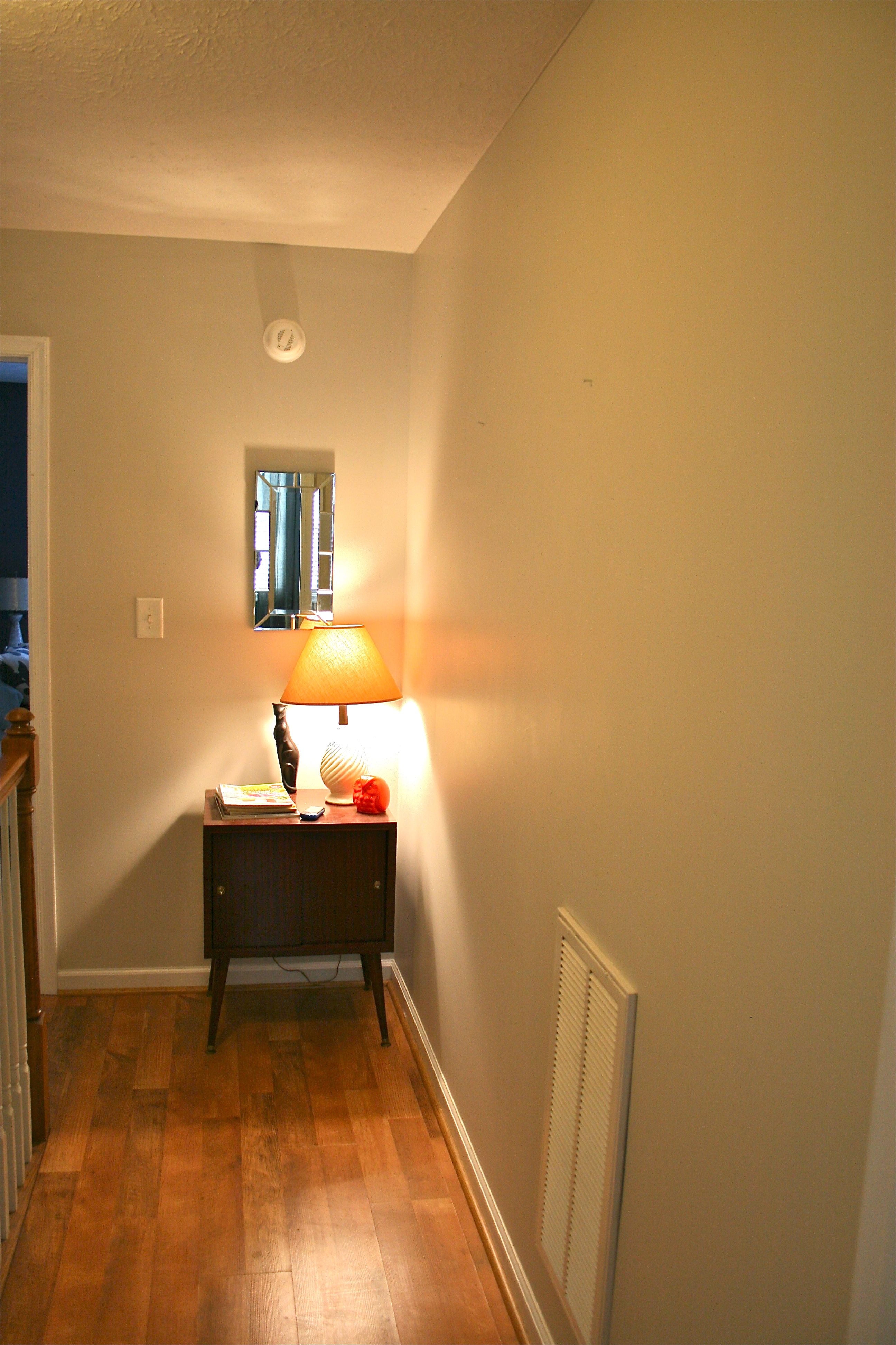
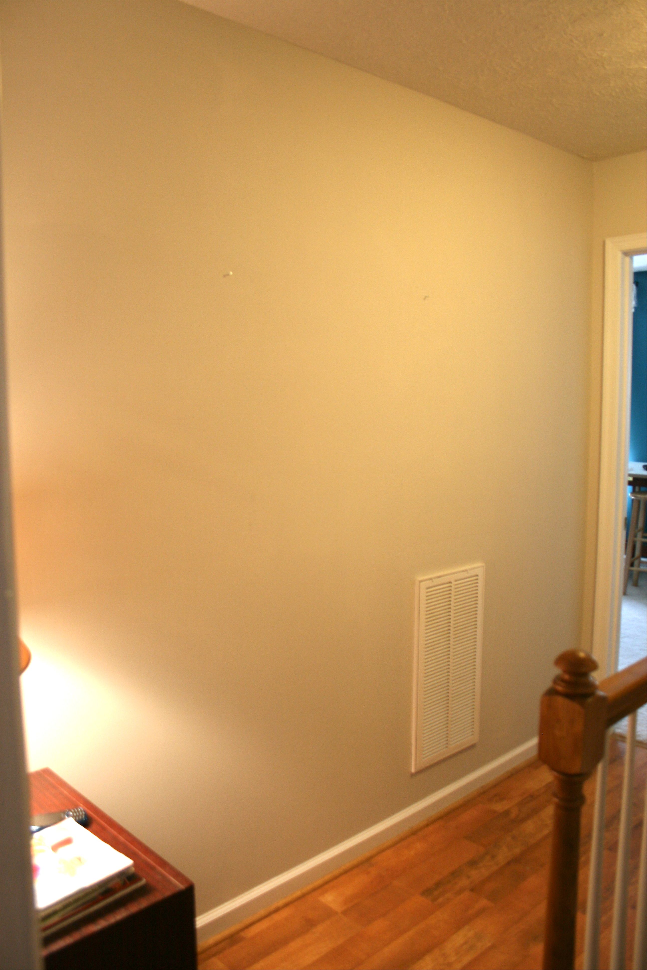
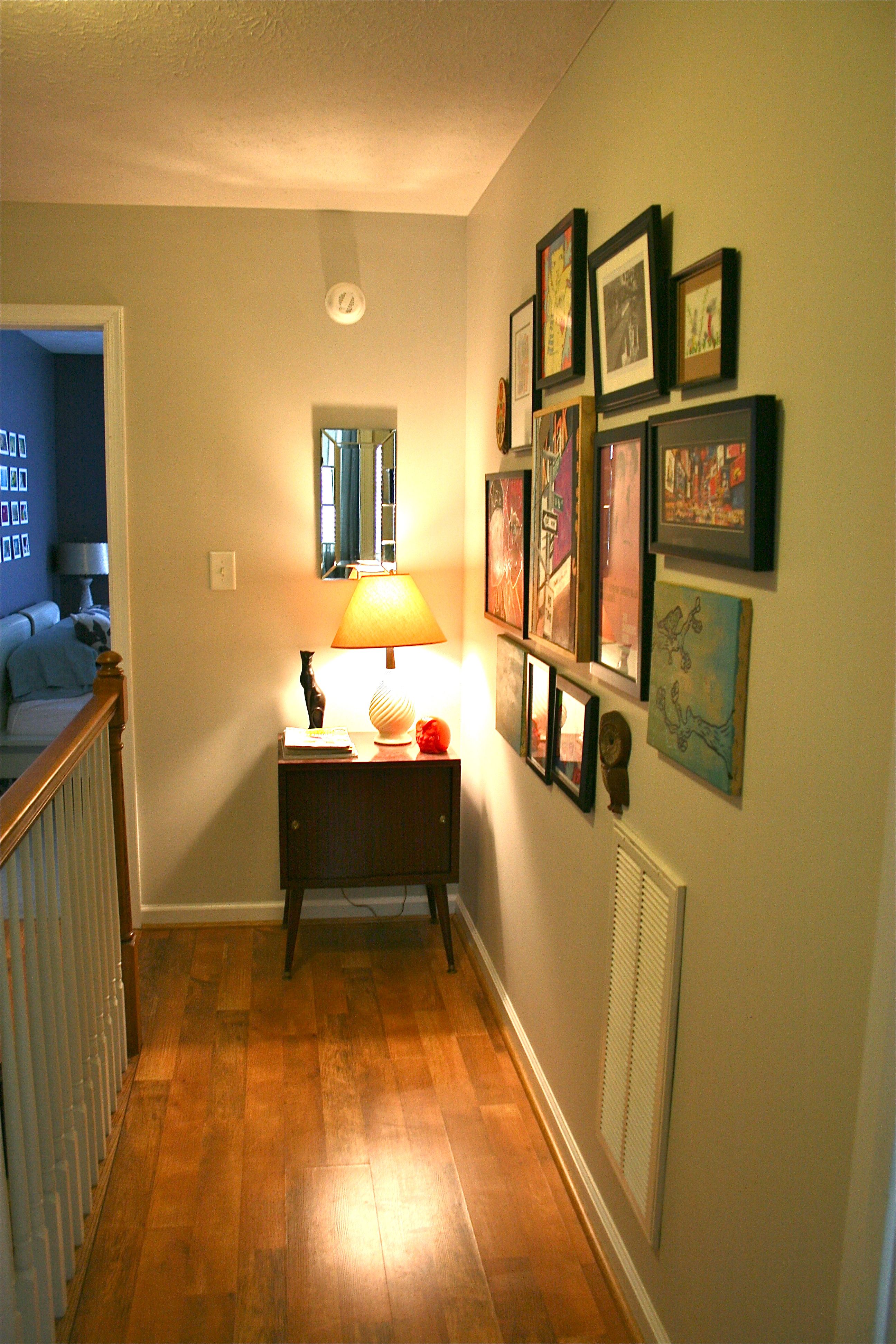
Here’s a reminder of its state before we got down to business on the revamp:
As an artist, I have a “thing” for wall art, which I don’t think too many people can blame me for. I’ve got pieces from fellow artists whom I met during my college years in the art department of CNU, I’ve got my own work, and a bunch of other random pieces from thrift stores, big box stores and everything in between.
Unfortunately, because of my random collection from all walks of life, I have amassed a rather eclectic pile of art – NOTHING really goes together and there’s not much of a theme, but I love each and every piece and don’t really want to part with any.
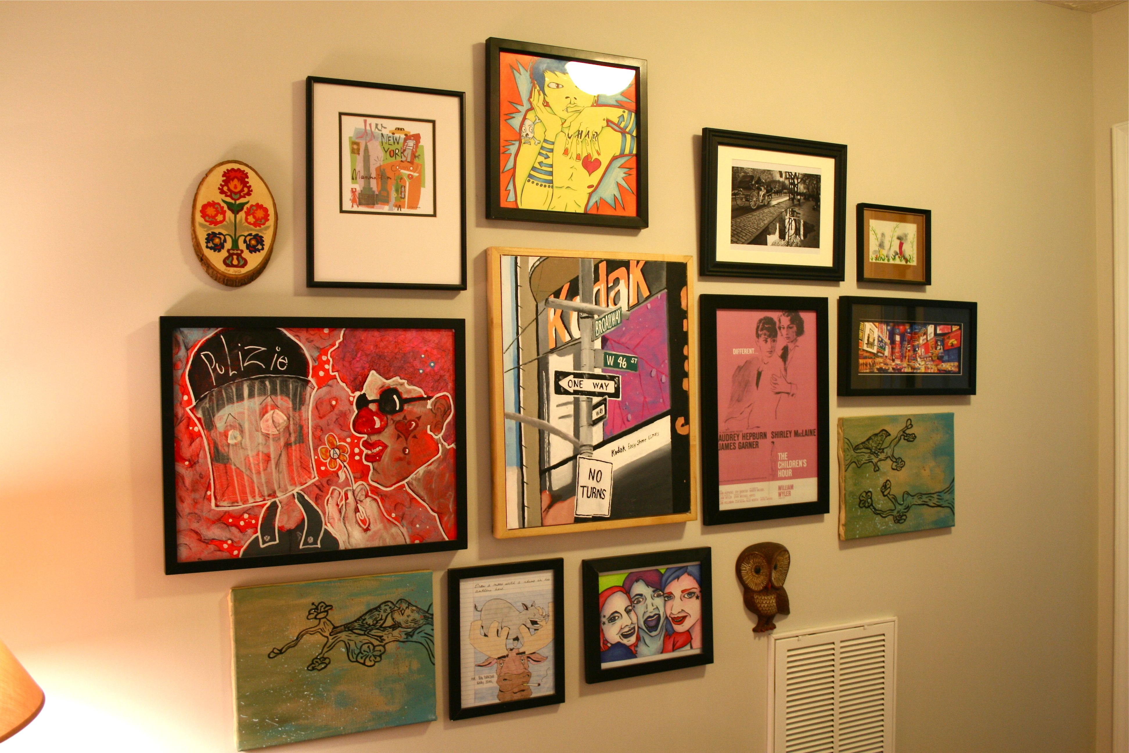
Solution? Create an art wall! In my mind, this is essentially a wall covered in art that is MEANT to look scattered and purposefully has tons of variety. I’m not sure that this is a technical manner of decorating a wall, but I thought “Why not?”. Plus, we have that big ole’ blank wall upstairs in the hallway just SCREAMING for color.
Well color it GOT!
To begin John helped me pull my unused art from the studio closet. I had them stored in tupperware, behind the shelving units, ON the shelving units and slipped between boxes. Anywhere I could fit them basically.
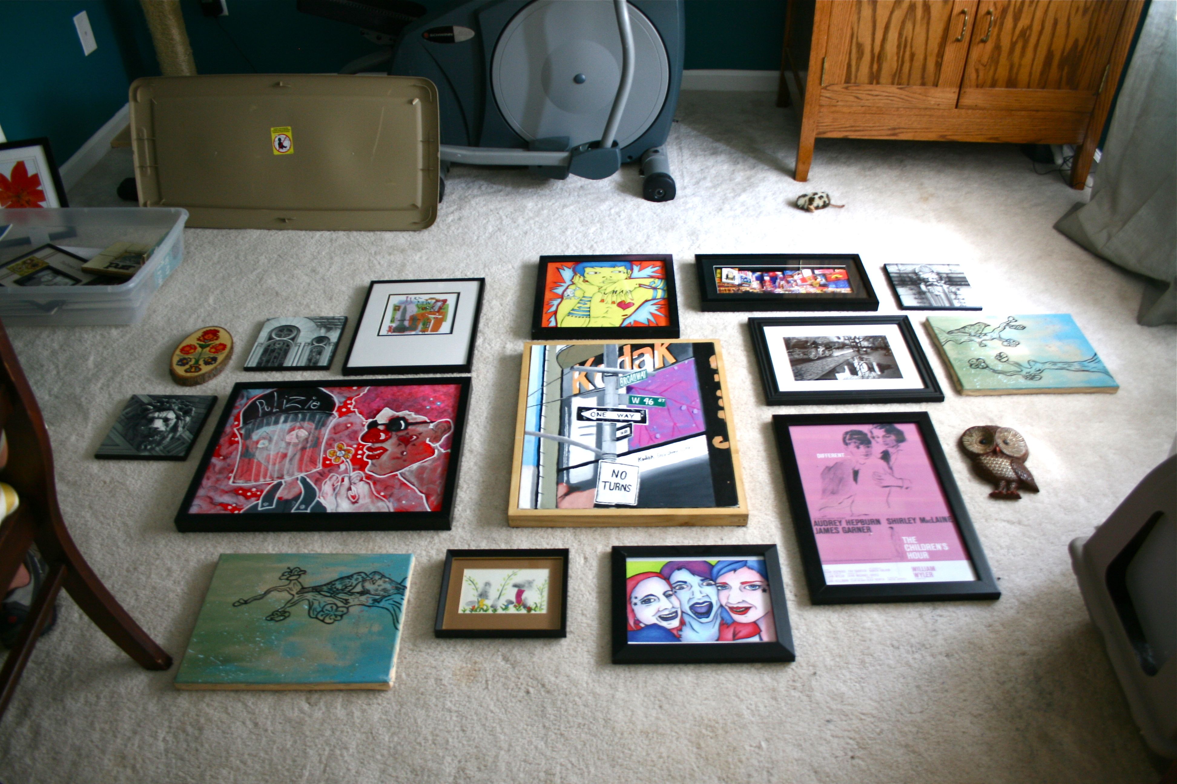
Once we got them all out, I simply laid them across the carpet in the studio and got to work coming up with an arrangement. I anticipated a very tight and random configuration and I think we succeeded:
(Don’t worry, I will explain some of the most interesting pieces in a sec)
As in the plate wall project in the kitchen, I used the photo above to help me align everything on the wall. I truly commend those who have the patience to make templates from newspaper or painters tape to get everything EXACT exact on their walls, but I just can’t do it…For me, I just refer back to my photograph of the collection on the floor (ex. the drawing of the three women should hang about halfway to the right of the “Kodak” New York painting). Oh and my “measuring” involves these simple steps:
- Hold the art by keeping your middle finger on the hanging wire/metal hardware/etc. that will line up with the nail
- With finger still in place, bring up to the wall placing it where you’d like it to hang
- Flick fingernail to the wall which will be an approximation of where the hanging apparatus should be for the nail
- Keeping your finger up against the wall, use your other hand to set the art down and have your incredibly sweet boyfriend/fiance/husband hand you a nail
- Place the nail under your finger place holder
- Remove finger from the wall and take the hammer from the outstretched hand of aforementioned sweet man
- Hammer in place and hang the art!
My measurements aren’t ALWAYS perfect, but they are usually pretty darn close. And it takes about half the time (even WITH a few redos). Sure I probably have a few extra holes in my wall then the more precise DIY-ers, but I like the “quick” approach. Let’s just say that Spackle and I are close friends 🙂
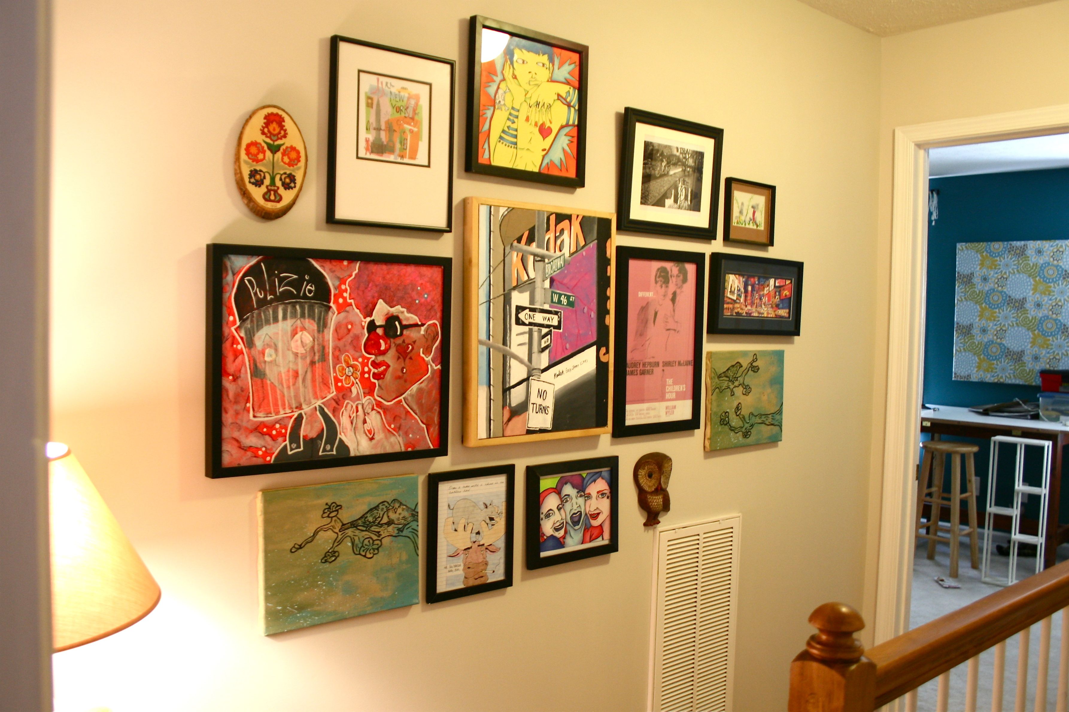
How’s this for validation of my elementary hanging process though:
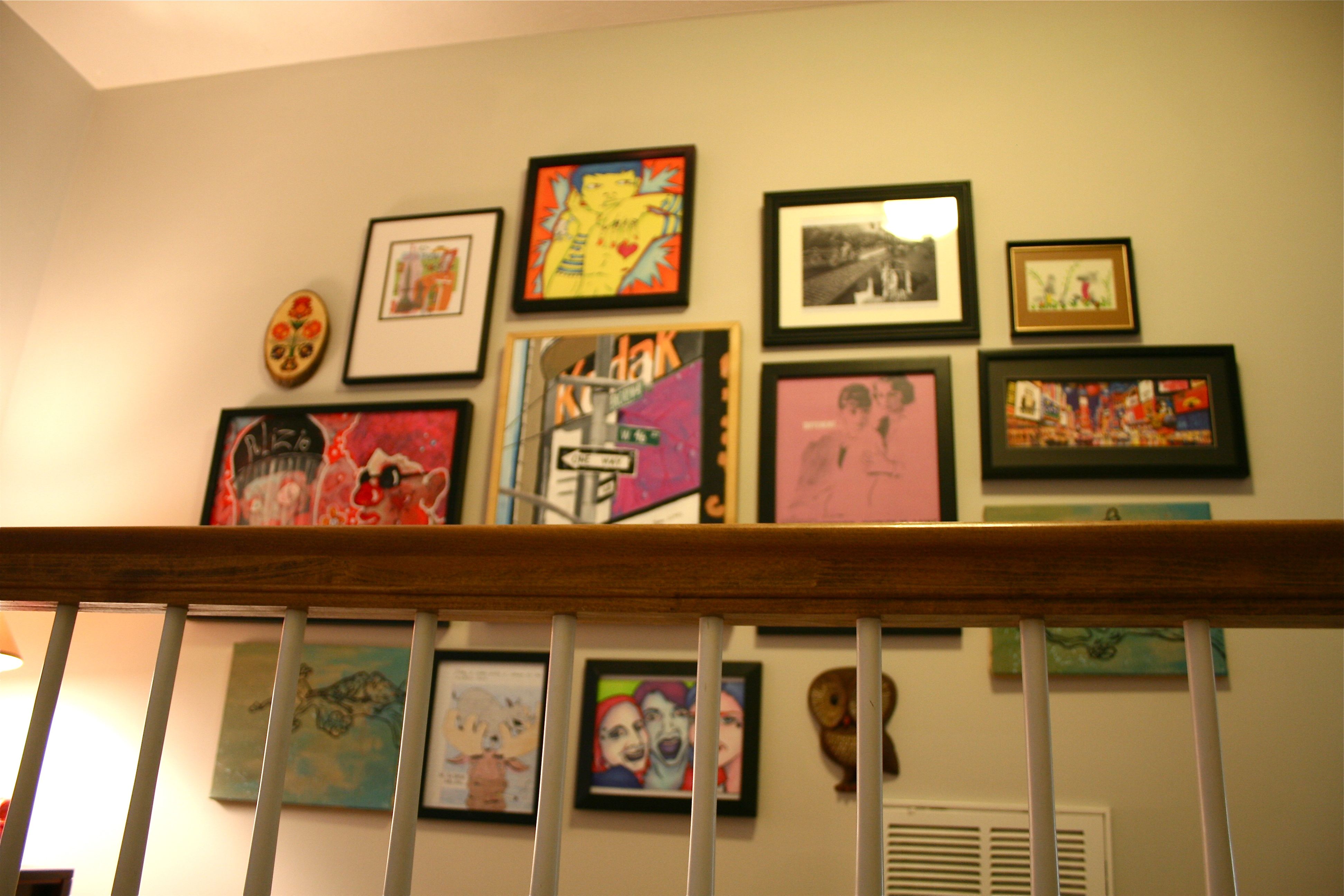
We ended up moving a few things around because the configuration got a little too crowded with the wall vent and the table and lamp that I forgot to factor in, but I think it looks pretty good!
I am entirely aware that this type of thing is not for everyone. Like I said, nothing matches and there is no theme (other than being random). But each and every one of those pieces of art is special to me and I like being able to see them in plain view rather than cluttering up an already-full closet.
There’s a fairly good chance that I will get some of the pieces out of my system after a year or so hanging in our hallway, but I bet there’s an even bigger chance that I’ll find something newly sentimental to replace them with. I like the versatility of the collection and of course I love having a gallery wall to do whatever I want with! Since it’s not in a very conspicuous area being upstairs in a pass-through hallway, I don’t think we’ll get too sick of its jarring color palate.
Now to explain some of the highlights!
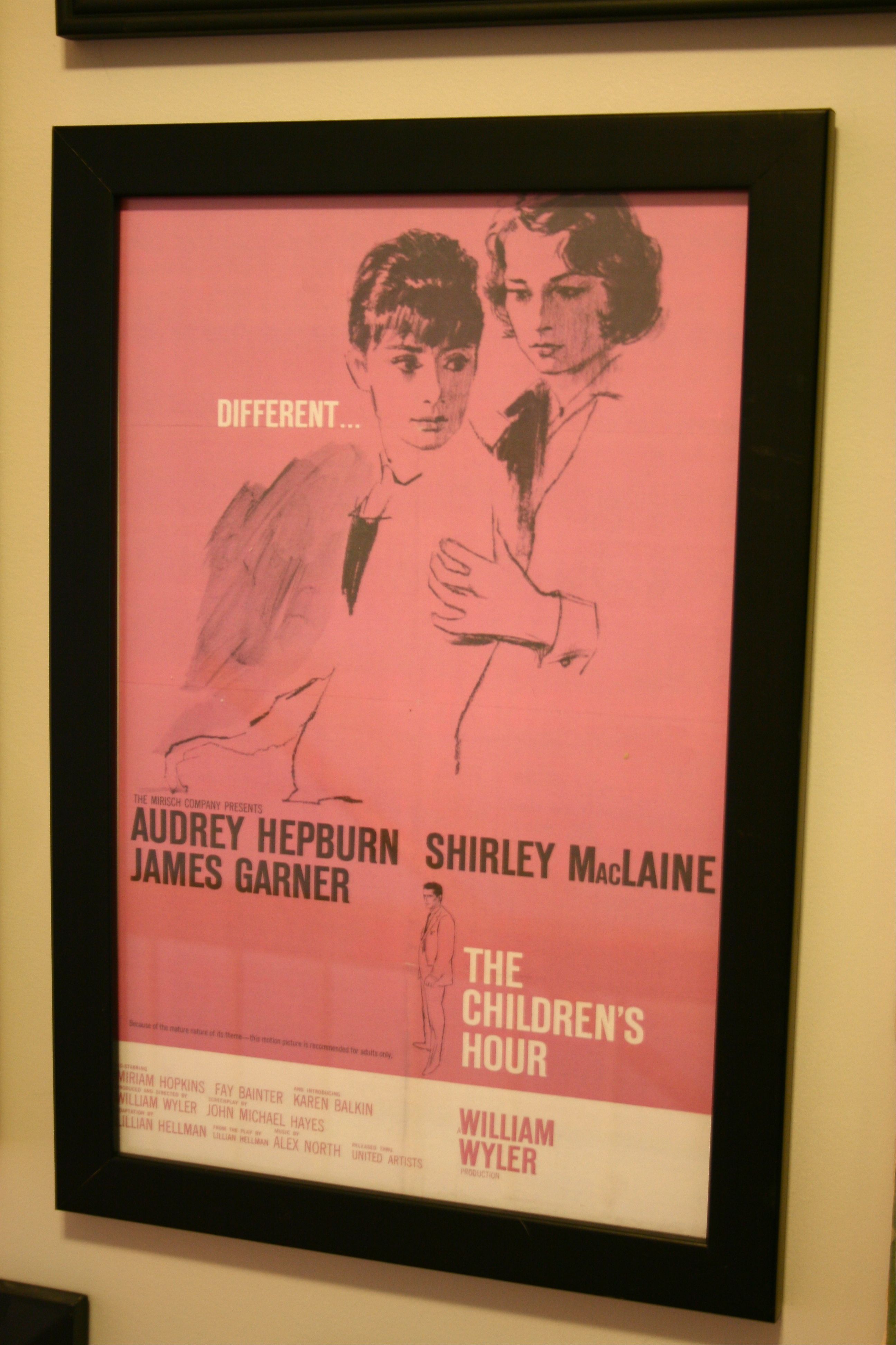
This one is a movie poster from an old Audrey Hepburn/Shirley MacLaine movie that I ADORE (disclaimer: REALLY intense and not a “feel good” movie, but some of the most superb acting I’ve ever seen):
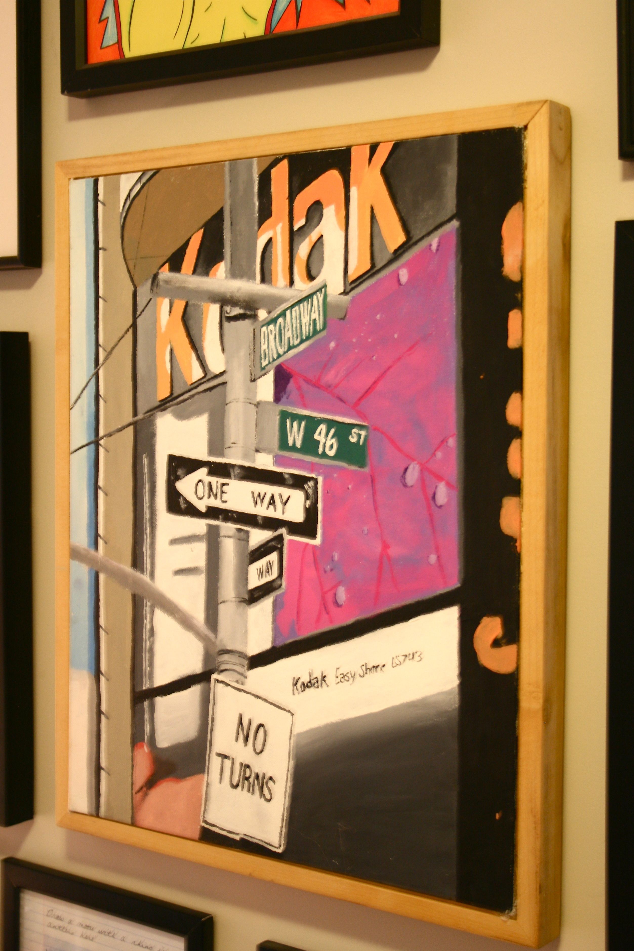
This is the very first painting I ever did in art school. It’s of one of my favorite places in the entire world, New York City (which ended up being the only vague theme of this collection):
It’s a terrible painting, but it’s definitely sentimental!
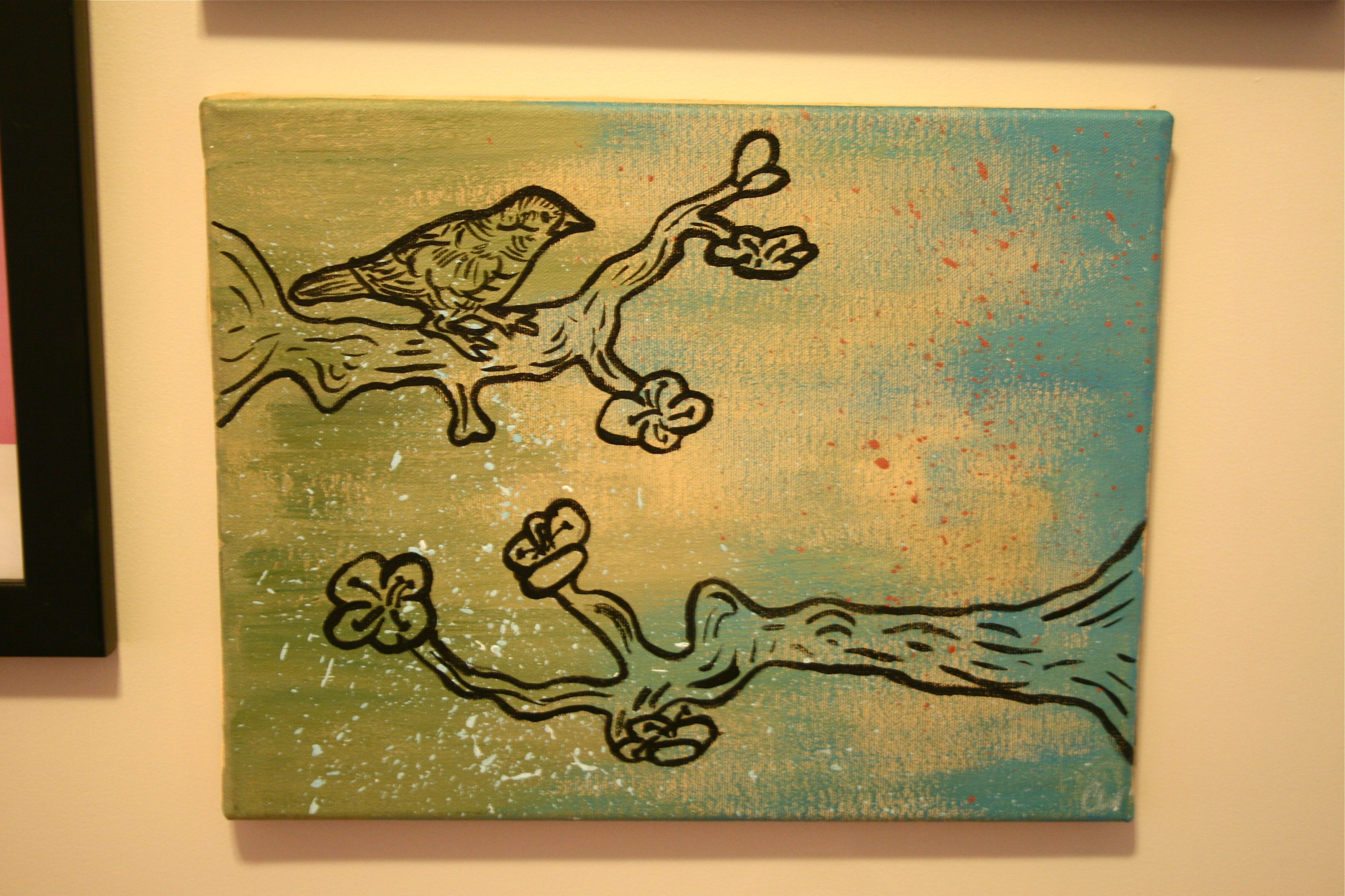
This next one is one of my more recent paintings – I’m not a painter, but it’s fun to splash color at a canvas every now and then!
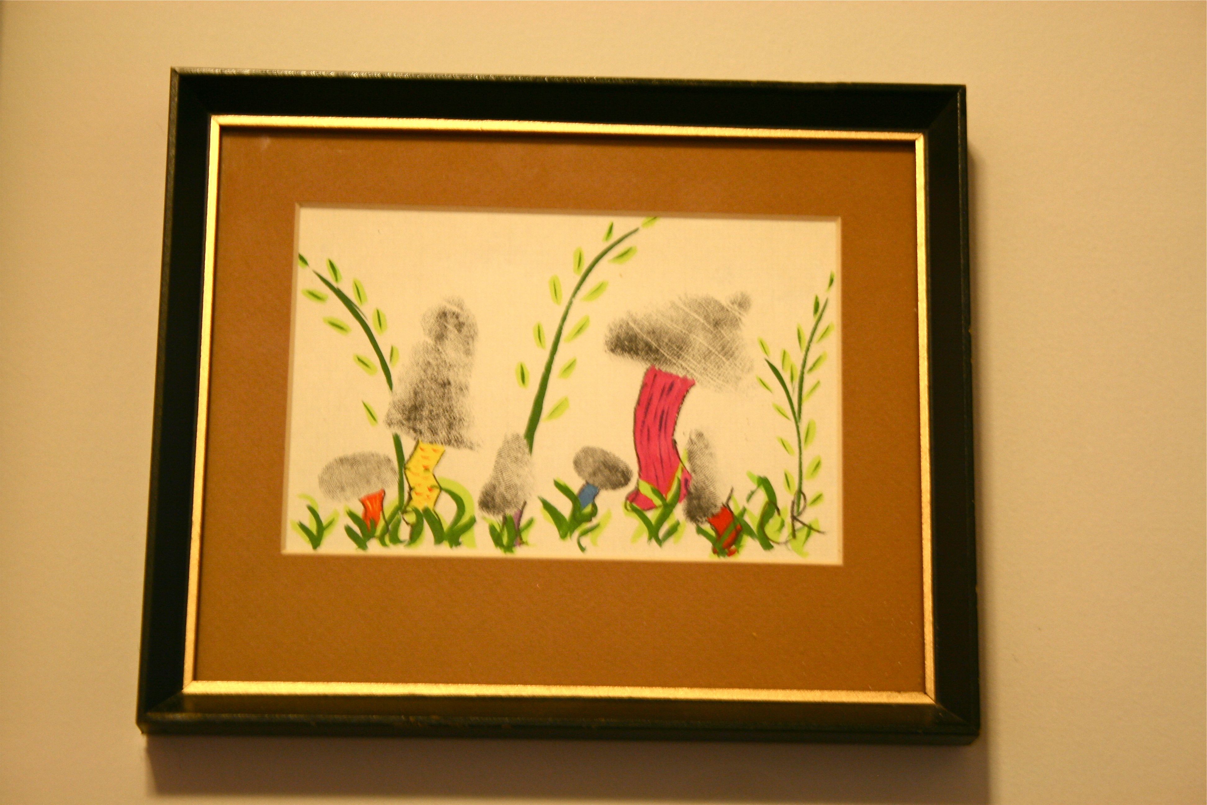
This is a fun piece I picked up at a thrift store for a buck or two – They are mushrooms made out of fingerprints. Totally weird, but TOTALLY fantastic:
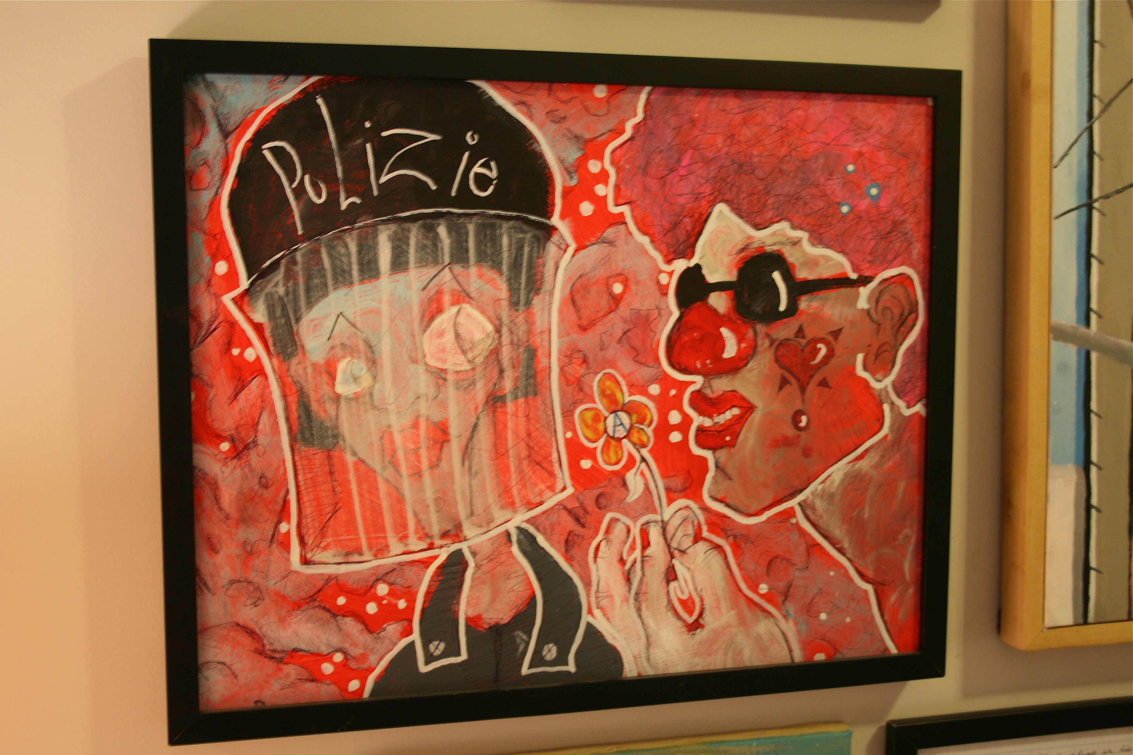
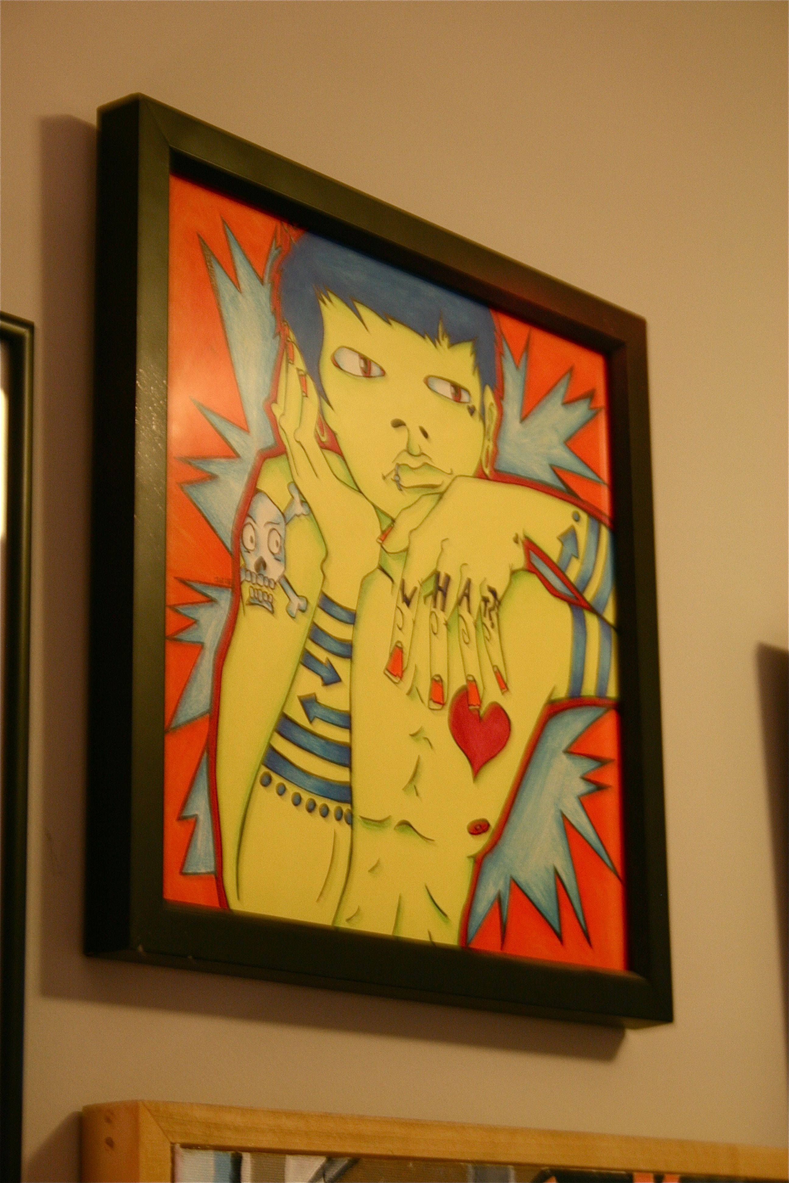
These next two are from art students I met and befriended in school. I fell in love with the gritty, graffiti influences in their work and feel like we’ll be seeing them rise in the art world.
Here’s the infamous moose/rhino portrait that my sister’s roommate drew for John – John has a weird thing for these animals, so what could be more fitting then one sitting on the other’s antlers? Sorry for the cigarette, the artist is a little crass…We are a non-smoking household! But it definitely adds to the moose’s character.
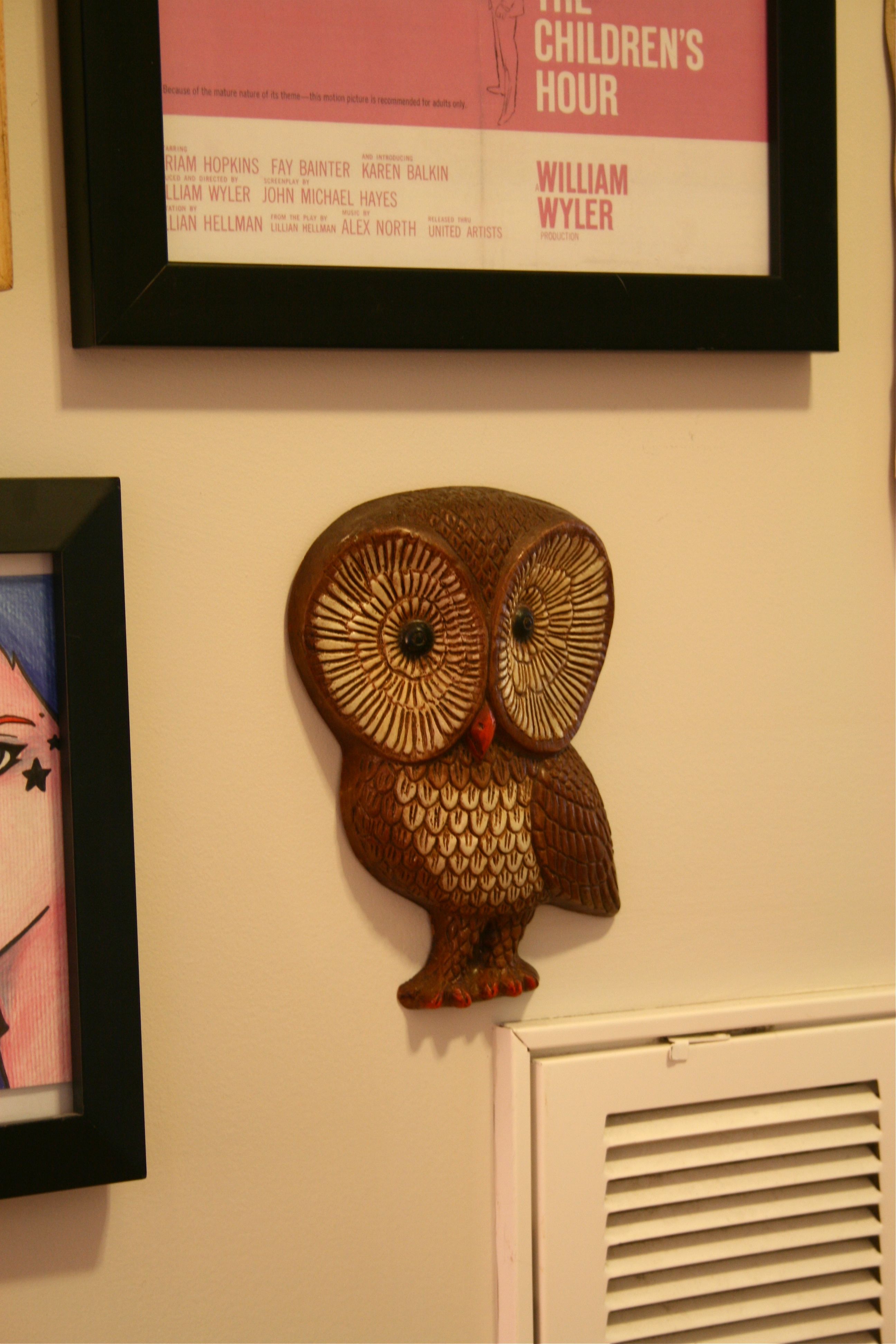
And finally, you know I had to throw an owl in there too…
I wonder if he would look fun with a coat of red spray paint to bring him into a more modern, Urban Outfitters-esque era?
So that’s it! That’s my crazy new art wall…Hope you enjoyed it and feel inspired to hang or start your own art collection!
Have a great weekend 🙂
