Good morning and welcome to this week’s “Pinspiration Monday”! If you’re new, this is a weekly feature where I take one of my favorite Pinterest pins and recreate it, giving it my own interpretation. It’s my way of making good on my ever-growing collection of images on Pinterest.
It’s no secret that mint is “all the rage” this year, and I’m the first to admit that I’m eating it right up (as evidenced by my studio and the backsplash in the kitchen). But there’s another color that has been getting some much-deserved air time lately: coral. I’m pleased as punch to see this color gaining a following – It’s so warm and festive and feminine.
While coral has all but taken over my wardrobe, I’ve been craving some kind of coral elements in the house too. If you haven’t already picked up, our home is built largely around four different colors – mint, yellow, white and brown/brass. There’s little to no trace of vibrantly warm colors like oranges or reds. Bringing in a coral element is my way of breaking out of the box. Here are a few of my inspiration pins…
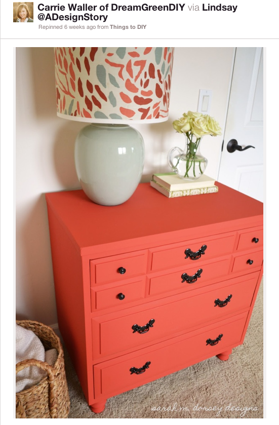
Source: Sarah M. Dorsey Designs
Source: The Sweet Beast
Source: Natty by Design
The mental seed was sown and it was just a matter of time before I tackled a coral furniture redo.
While the plan had been in place for a while, I decided to try something a little new when it came to my decision making for this week’s “Pinspiration Monday” feature – I opened the choice up to you guys! If you’re a follower on Facebook, you may have seen the post shown below, inviting you to choose which DIY project you’d rather see me tackle: the color block clock (via DesignLoveFest) or the coral side table (via Sarah M. Dorsey Designs). In the end, the coral side table was the winning project and I couldn’t have been more excited to hop to it.
First, the table. I didn’t have any chunky side tables with drawers like my inspiration image, but I DID have a lovely, delicate angled table that was in dire need of a face lift as it was. Chipping paint and a stained/marked up top left quite a bit to be desired.
To prep the piece for painting, John helped me by sanding it down. All of the original paint didn’t need to be taken off – The surface just needed to be roughed up a bit to make sure the new paint had something to “stick” to. Once the sanding was done, I took a tack cloth (a super sticky type of fiber) to the piece to get all of the left over sanding bits and dust off.
As you can see below, the old paint is still very much there, but a quick sweep of your hand across the surface and you could feel that the gritty texture was ready for its first coat of new paint.
Speaking of new paint, what color did I choose? I went with Valspar’s “Powder Peach.” After getting such stellar results with Valspar paint in our studio, I am now a loyal, die-hard customer and fan. As with painting drywall, “Powder Peach” went on like a dream. It hardly even NEEDED two coats, but I went the extra step just for durability sake.
Here’s the side table with only one coat of the paint. Now, I’ll admit that I wish it was a TOUCH, a HAIR, a LITTLE more orange coral than pink coral. In these still-wet photos it reads a tad pinker than I’d like, but the dried finished product is definitely an improvement. If you want to avoid a pink finished product, my advice to you is choose your favorite coral paint swatch and then get the next one available that has more orange in it.
After painting on one last coat that evening and letting it dry overnight, I was ready to put it in place upstairs. It’s undeniable that trendy mint and coral are pretty much made for each other, so into the mint studio it went. The space could use a little coral warmth anyway…Here’s the table unstyled but dry. See how it already looks less pink and more coral?
I love that little hint of a reflection – That’s from the semi-glass finish I chose for the paint. If you want to add a little elegance to a furniture paint project, stick with the gloss finishes.
And here she is all styled up. I added a little stack of books, a $2 Asian porcelain dish from a yard sale, a $7 lamp from Goodwill and the framed Valentine’s Day card that I put together earlier this year. The brass from my new thrift store lamp ties in with the bed’s headboard, while the yellow frame and card match the bedding. The wild, mismatched colors of the books and little porcelain bowl are meant to break up the matchy matchy look and continue the eclectic vibe begun by the random art over the bed.
You’re probably thinking that it looks VERY pink in the above photos and you’d be right – The natural afternoon light streaming in through the windows was pretty much spotlighting those pink overtones. But the orange undertones, however subtle, are there – Especially in person. This Instagram sneak peek I shot last night around 7 p.m. may be a better representation of the true coral color.
I am still getting used to anything in the red family making its way into the decor of our home, but I am excited to add more in the future. Little doses people, little doses…
Have a great week!


