To me, the entryway of a house is one of the most important areas to pay attention to when decorating/arranging…It’s how your home says “Hello!” to your family, friends and guests and it also has to be functional for YOU when you come in and out of the front door multiple times a day.
With that said, I knew that I wanted to do something fun with our entryway. It’s not much of an “entryway” to speak of – More like the first wall you come to on the way down the middle of the house to get to the kitchen. So that was the first challenge…How to make a fairly standard wall feel unique and like a place to land.
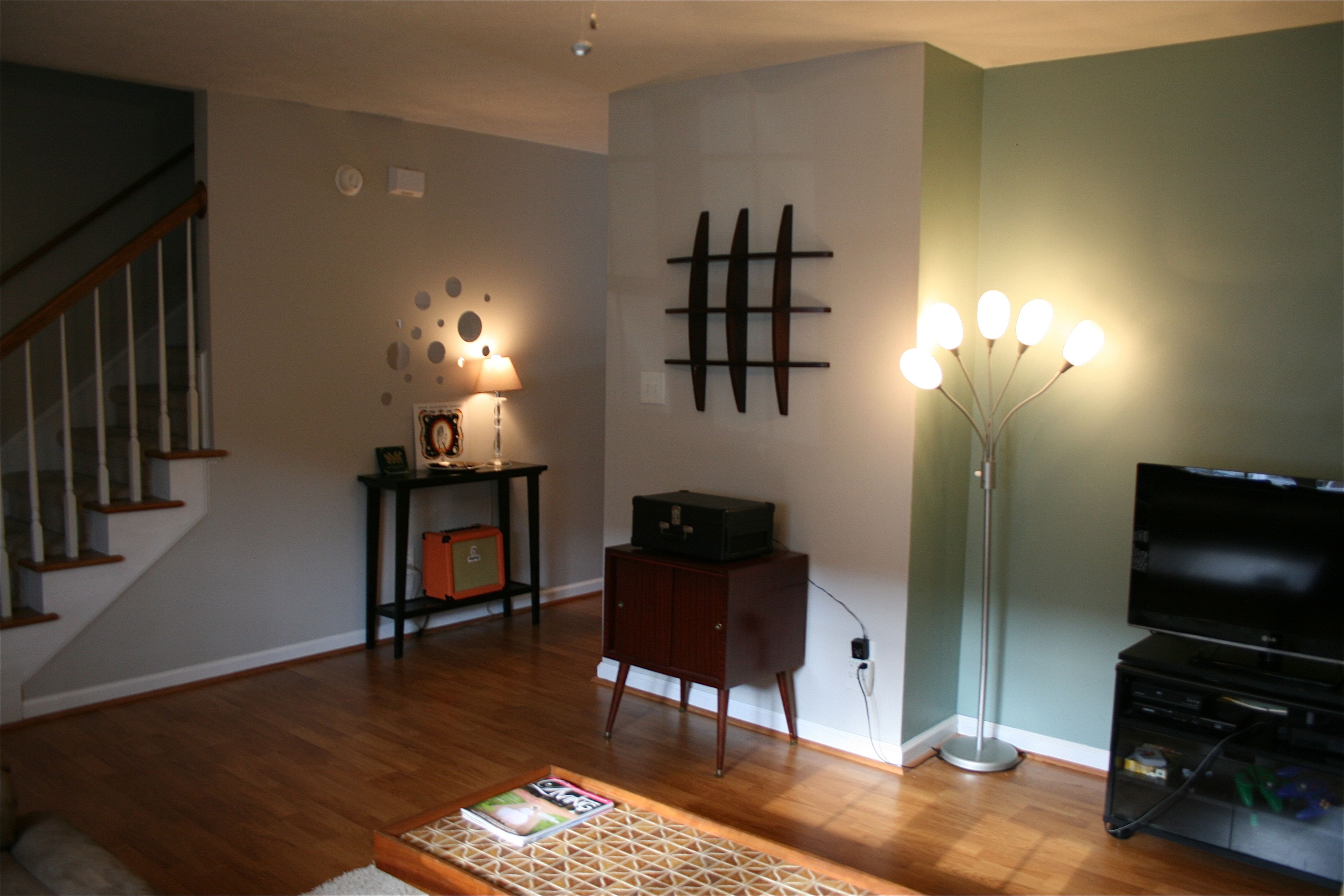
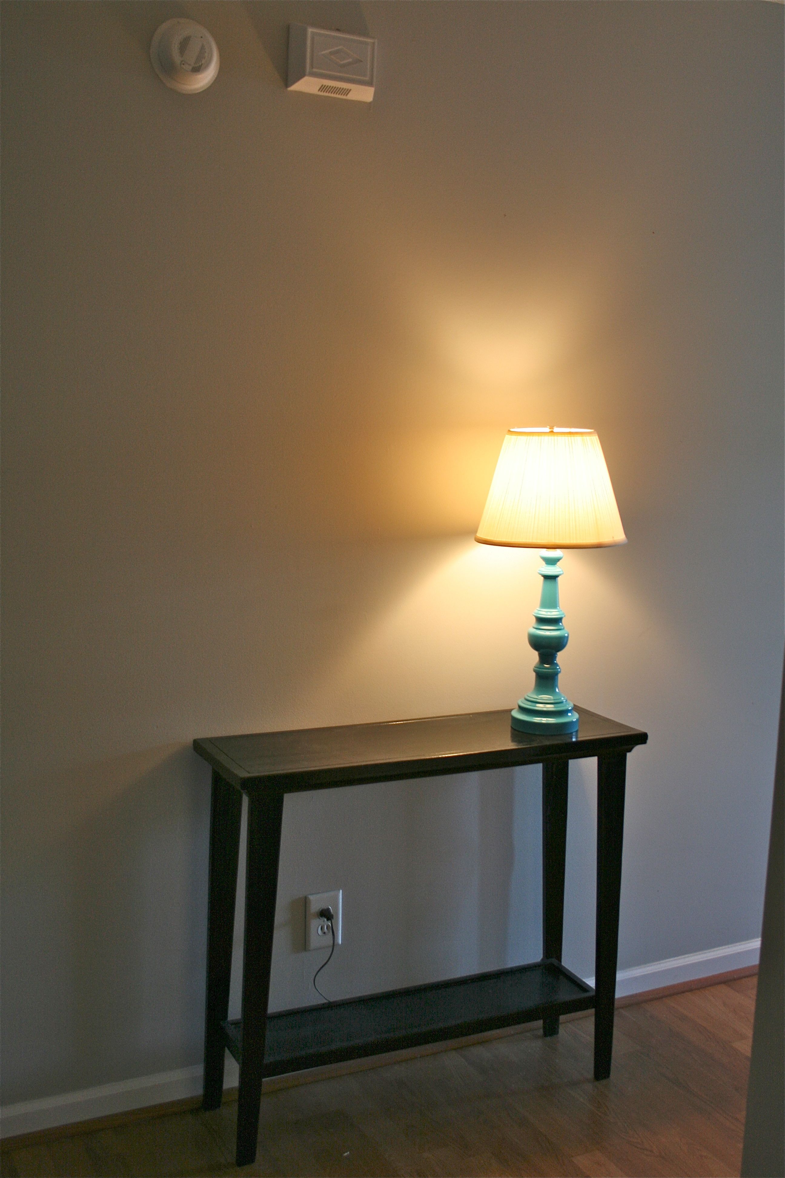
The first step was getting a piece of furniture that could serve as a place to set keys, cell phones, etc. That came to us in the form of a Craigslist piece that a good friend of mine no longer needed. We scooped the thin black table up from her and her husband for a great “friends and family” deal of $20 and put it in its place on the wall.
Here it is in its first “layer” of the room with a lamp and some $15 peel-and-stick mirrors we picked up at Pier One (we thought they had a sort of retro feel to go with the rest of the house).
We tossed in some colorful pieces, like the bright orange amp and record, to mimic the collection of other records we had mounted on the opposite wall in the living room.
But, as you can tell from the below angle, it wasn’t “just right” yet…The mirrors feel a little unbalanced with the weight of the table and the wall is definitely big enough to handle some more impact (the length of the wall goes further past what you can see in the picture).
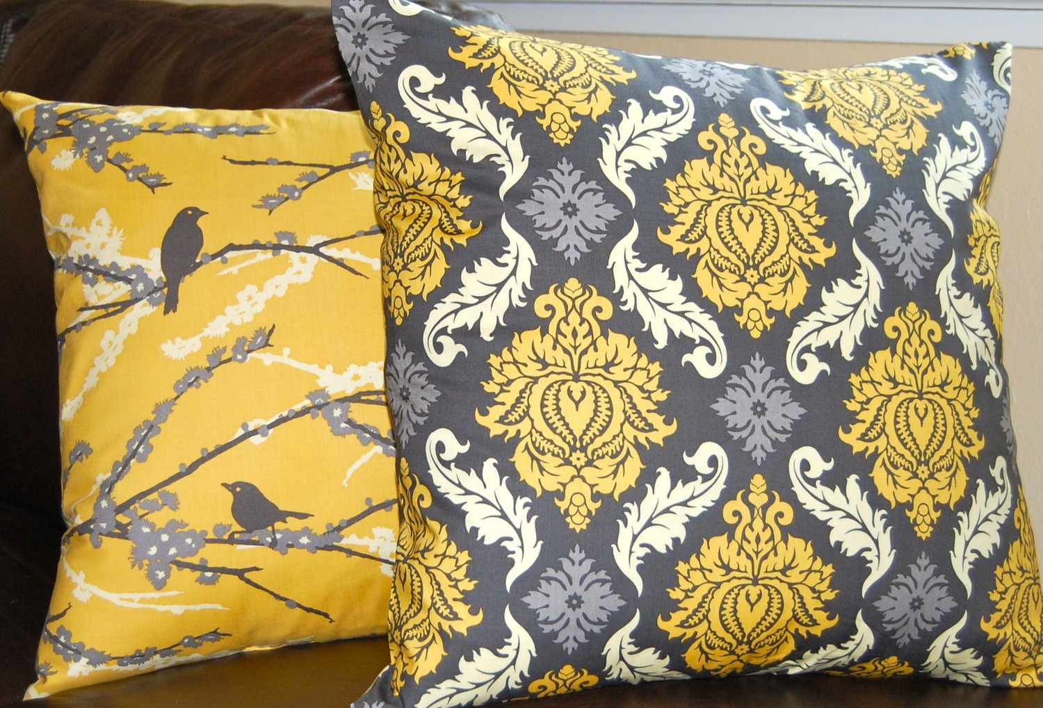
I knew it wasn’t quite there yet, but I figured we had time to let the room evolve. Then, about two weeks later, I stumbled upon these pillows and the whole room started to fall into place rather quickly!
After planning pretty much every other area of the room to play off of the new pillows, I focused my mental attention on the entryway. I have been aching to do a big collection of frames all in one color somewhere, and this seemed to magically offer the perfect place to give it a whirl!
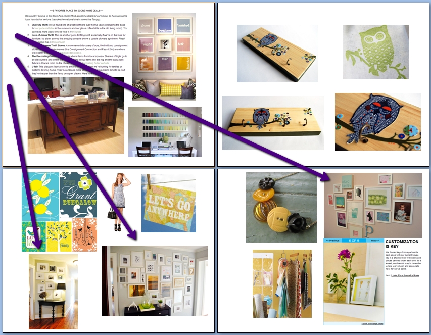
Once I moved the mirrors to a smaller section of wall behind the front door (where they feel SO much more balanced), I got to work planning the frames. I knew I wanted them to be one consistent color and after browsing some of the image sheets I’ve put together (which are essentially just word documents with copy/pasted pictures off the internet that I am drawn to or want to try out), I noticed these three images:
I loved the crisp white frames and the fact that the frames were all different sizes.
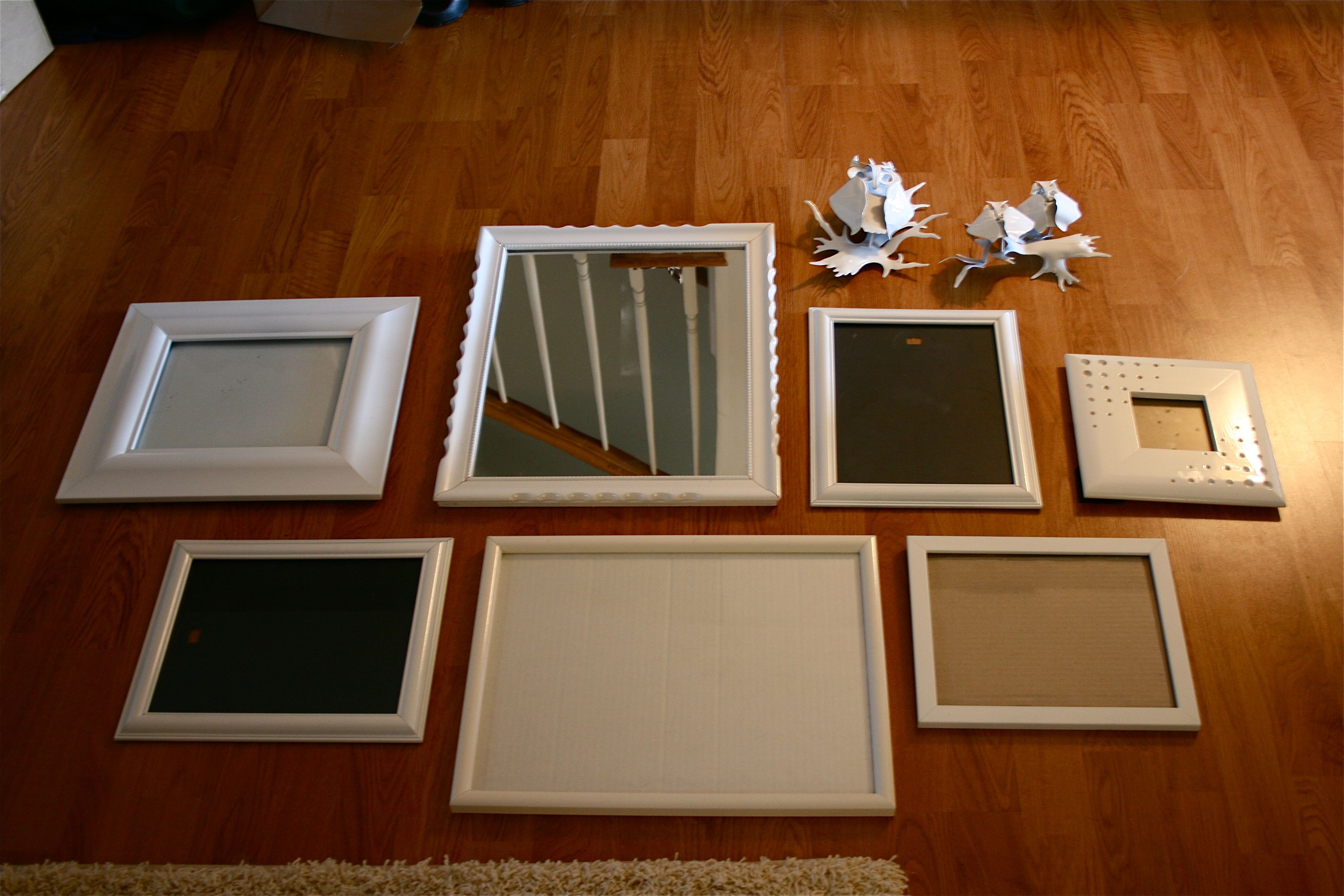
So I went hunting for frames 🙂 Off I went to my apartment and packed up as many frames as I could from closets and walls. They didn’t have to match because I was planning on spray painting all of them the same color. I even picked up a mirror and some metal owls that I had on the wall. The owls were originally a brownish, bronze color but it suddenly occurred to me that they would look GORGEOUS in pure white. Plus they would add a little dimension to the collection of flat frames and mirror.
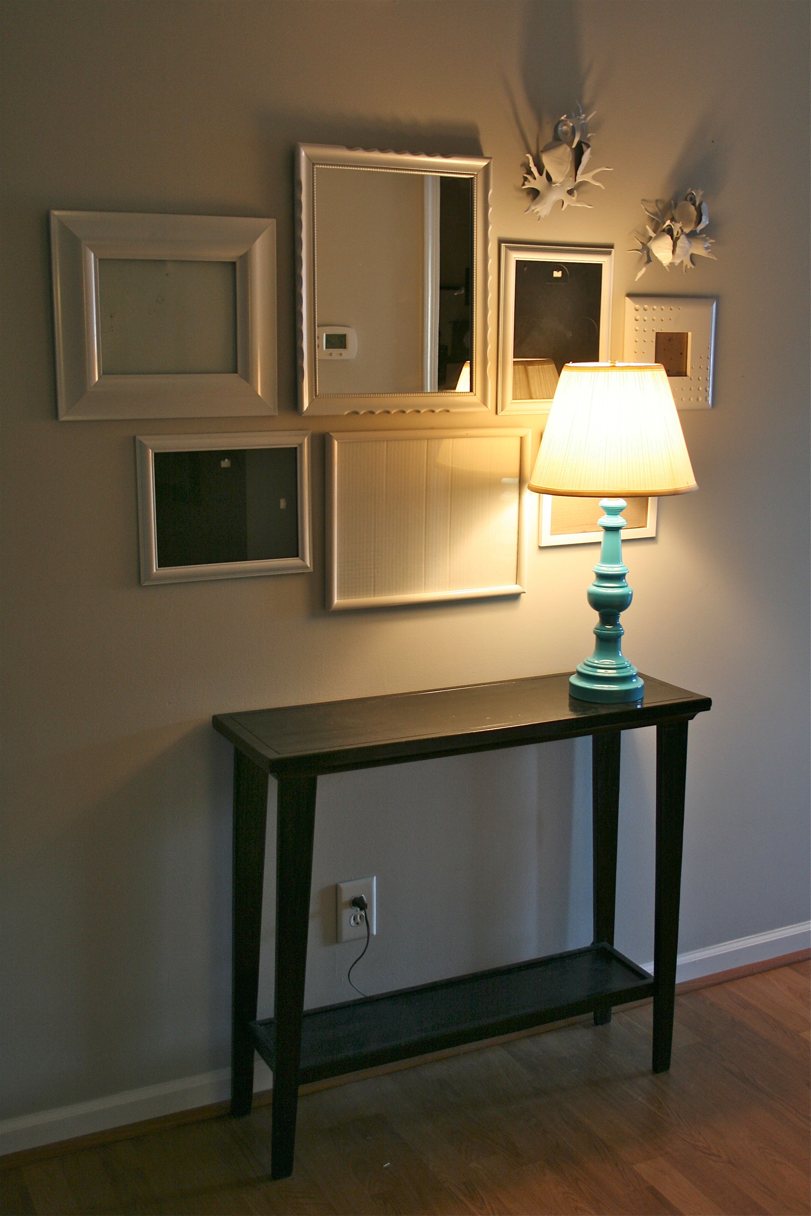
So, while John was diligently working on the Eden lamp situation, I gave everything a couple of coats of $3 glossy white spray paint and laid things out on the floor of the living room. This was the arrangement my sister (who was over for dinner) and I came up with…
I was pretty giddy at this point, because the collection ended up really taking on a life of its own…Only two of the frames actually “match” – The rest are completely different from one another. All of the varying edges and molding became really obvious and pronounced in the white finish.
To continue with my anti-mathematical manner of hanging things (i.e. “eye-balling it”), I picked out the frame that seemed to be the most centered of the asymmetrical arrangement (which happened to be the biggest frame on the bottom row) and hung it on the wall over the console table at a height about 4 or 5 inches above the place our plate o’ keys will sit.
The bottom row was easy to get up on the wall since I just had to hang the other two frames about an inch away from the center frame. I had to look at the above picture on the camera to see where the mirror started over the center frame on the bottom row (about a 2 inch overhang on the left side), but after that the rest fell into place!
Sorry about the AWFUL light in these pictures – It was about 7:30pm by this point and natural light was fading fast…But here’s “before”, complete with the redone lamp from this post:
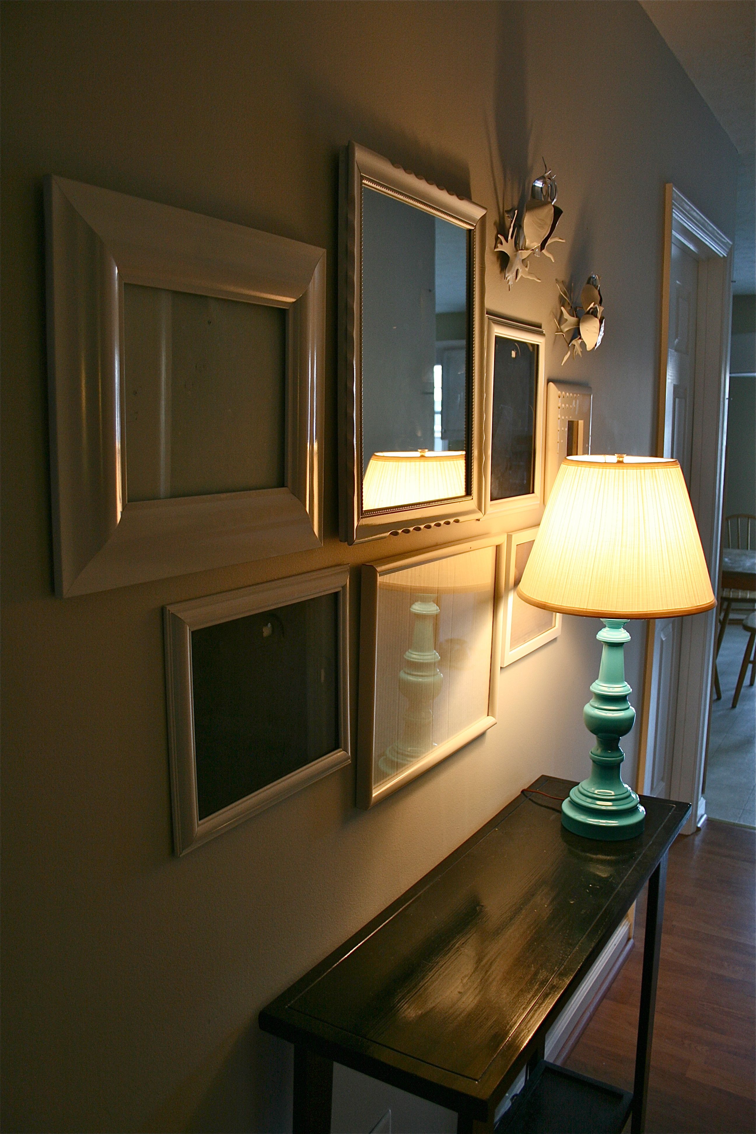
And now after!
I love how much more impact the entry wall has now! I left all of the frames empty for now until I can fill them with the perfect art. But once they are, I think it will be a place that guests will be drawn to.
Thus, we finally have a real entryway!
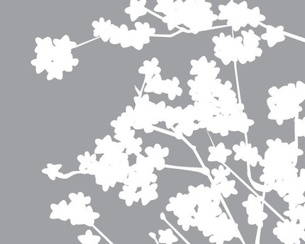
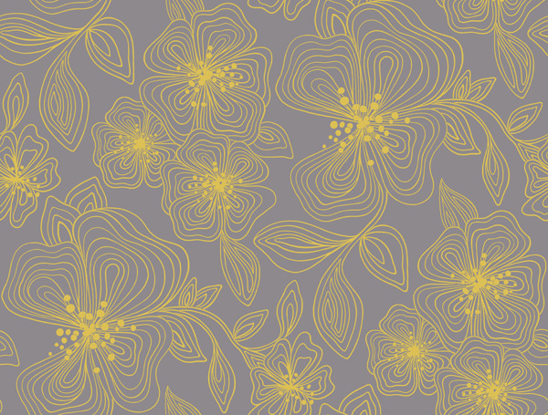
Here’s a teaser on what’s going in the frames…
Everything is meant to coordinate with the now-famous inspiration pillows:
I’m going to fill the frames tonight, so stay tuned for a final “after” shot!
Oh and the price for this project? Here’s the breakdown:
- Console table: $20
- Lamp (including all the supplies to refinish it): $10
- Frames: $0
- Spray Paint: $3
- Art to fill frames: $0 (just printed images off of the internet!)
- TOTAL: $33
I think that’s $33 well spent to add some warmth, personality and (maybe most importantly) functionality to the house!
(Photo Credit for image sheet frame pictures we used; The images of the teaser frame art came from Google image searches)
